
Spring Refresh | Exterior Paint
Spring is here and refreshing your home may be at the top of your list as the weather warms up!
Over the next 3 weeks I’m going through some of my favorite colors, organization products, and decor to refresh your home. The TOP request I get from client inquiries, this year, is paint color consultations. Covid has everyone stuck at home, staring at the walls and really wanting to make some changes. Today we are looking at exterior home colors. Exterior siding is popular in certain areas, and painted brick has been gaining popularity over the years. If you’re painting your brick, I recommend Ramabio Masonry paint; it’s what we will be using in a couple weeks on our new home.
It’s important to note that lighting, including natural light and the way a room faces, and other materials can influence the way a color looks so although it may be my favorite it may be totally different in your home. I ALWAYS recommend testing out three samples, at 2’ x 2’, on your wall and leaving it up for a couple days to look at. Exterior lighting is much more harsh than interior so if you’re going white, I prefer a soft white; especially in this Texas sun!

SNOWBOUND by Sherwin Williams
If you’re looking for a paint color that is not too creamy, Snowbound may be right for you. It has a slight amount of gray to dull the white a little, giving it a soft appearance. At an LRV (light reflective value) of 83, it is slightly less reflective than the brighter white like Pure White (SW) and Simply White (BM). Going over 85 will result in a bright white.

Image via Homebunch
WHITE DOVE by Benjamin Moore
If you are wanting the look of a white, modern farmhouse, White Dove would be a great choice! It has a warm under-tone so it pairs well with wood tones and stone. It reads slightly off-white, having a hint of gray, but with an LRV of 85 it appears brighter than Snowbound.

Image via Kroiss Development
SHOJI WHITE by Sherwin Williams
Shoji White has a mix of grey and beige undertones, making it read as a light greige. Because of the beige it can sometimes take on a “pink-ish” hue. With an LRV of 74, Shoji White will still appear white but with a creaminess that is less harsh.

Image via @mrsparanjape
OYSTER WHITE by Sherwin Williams
If you’re wanting to move into slightly more off-white, Oyster white may be a good pick for you. It’s LRV is about 74 so it will still read as a white, but the beige and grey undertones create a sense of warmth. This color would be perfect for a home with a more traditional architecture. This warm white looks beautiful on painted brick and with wood and dark tones.

Image via Willow Homes
NATURAL CHOICE by Sherwin Williams
This is another great creamy off-white for those who don’t want a bright white. The LRV is 73 making it the least bright of the five I have listed. The under-tones of grey and beige give this color some depth, but when comparing it to Oyster White, I found Natural Choice had slightly less gray. If you’re in a traditional community that is scared of white, this is a great one to use! We are actually using this on our new home.

Image via Homebunch
REPOSE GRAY by Sherwin Williams
For a light warm gray that doesn’t appear too stark or cool, I like Repose Gray. In some lights, this gray can appear like an off-white similar to the colors above. If, you are wanting a versatile color that doesn’t have too much beige, this is a great choice!
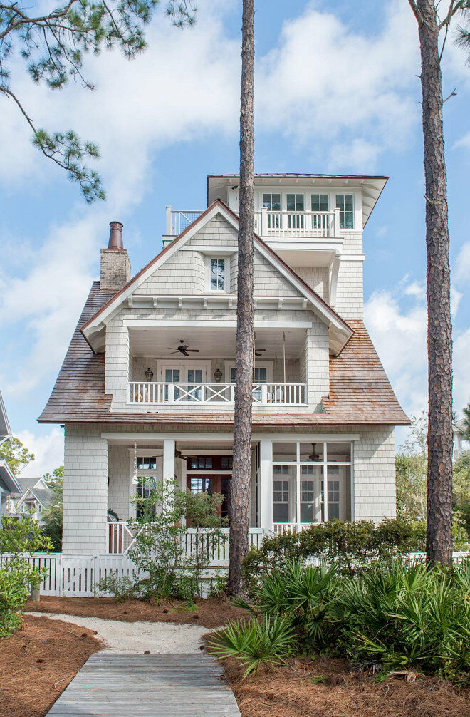
Image via Homebunch
DORIAN GRAY by Sherwin Williams
I always try to avoid grays with a blue under-tone unless I want the color to look blue, so for a good mid-tone warm gray this is perfect! It is a timeless neutral that still has depth.

Image via Hask Custom Homes
GAUNTLET GRAY by Sherwin Williams
This gray is still warm, but is a little darker. It goes well with traditional farmhouse architecture and ties into wood tones, black, white, and stone very well. If you don’t want a beige but still want your home to have a classic feel, this is a great choice!

Image via The Gray Cottage
URBANE BRONZE by Sherwin Williams
I love a classic bronze finish and this color is that, in paint form! Urbane Bronze is a darker gray with more brown undertones that make it appear bronze. In darker lighting, it can appear almost black, but if you are not wanting to go stark black, gray, or brown than this is a perfect mix.

Image via Rugh Design
IRON ORE by Sherwin Williams
This is a deep “almost black” charcoal color. I love this for a traditional siding home with a white trim or on a more modern home. The green of the landscaping really pops off this color.

Image vis @housesevendesign
ONYX by Benjamin Moore
If you want drama, this is the color for you! This black has a warm undertone which makes it feel a little less stark than a true black. This color is suitable for both modern and traditional homes.

Image via SF Girl
I hope this guide helps you in your exterior refresh! Stay tuned in all of this week and next for more spring refresh tips and sources:
March 30- Kitchen and Pantry Organization
March 31- White Paint Colors
April 1- Office Organization
April 2- Black Paint Colors
April 5- Closet Organization
April 6- Gray and Putty Paint Colors
April 7- Toy Organization
April 8- Blue Paint Colors
April 9- Our Favorite Rugs
April 12- Green Paint Colors
April 13- Our Favorite Wallpaper
April 14- Our Favorite Art
April 15- Our Favorite Accessories
April 16- Outdoor Update
Enjoy,
Nikki