

Spring Refresh | White Paints
Spring is here and refreshing your home may be at the top of your list!
As I mentioned, Monday, paint consults have been my most requested service. Though some people are still wanting gray interiors, many are requesting white. But how do you make sure your white is right for your home? This is a tricky questions as white is probably the HARDEST color. I recommend you look at the undertones and try to coordinate it to the undertones in your materials. I am always someone who leans towards a warmer white as opposed to a cooler, stark white.
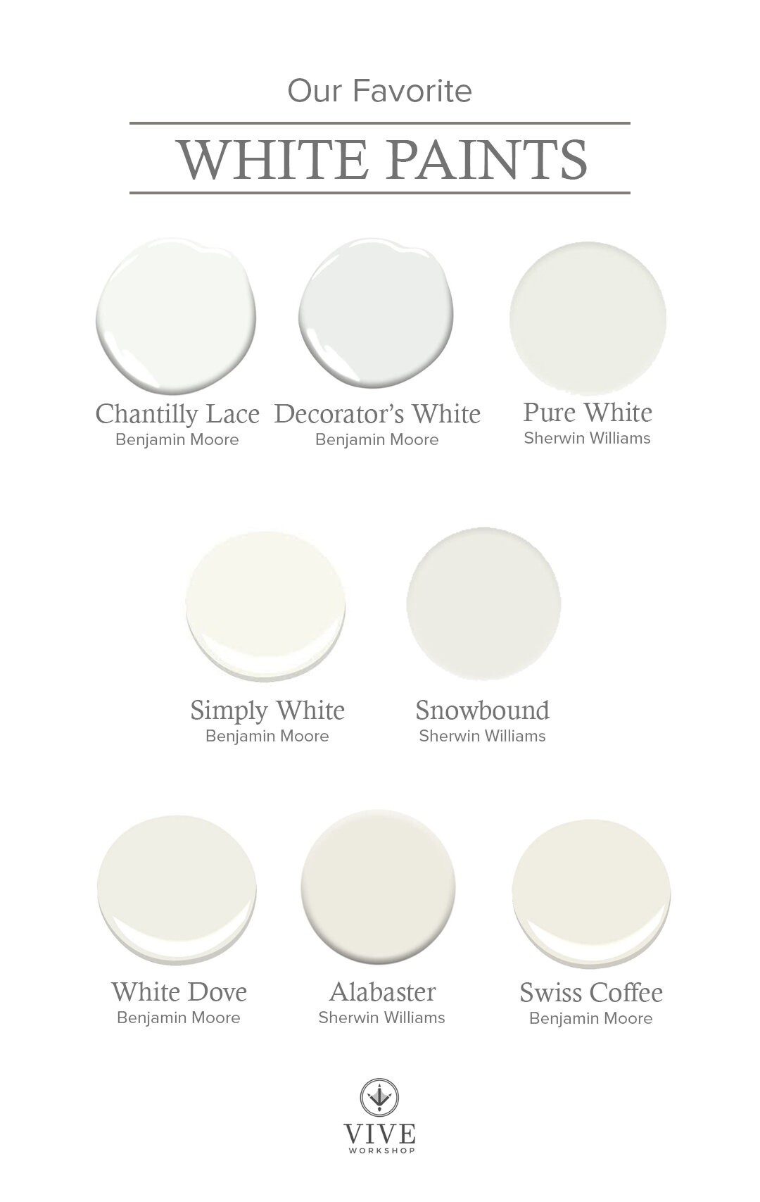
CHANTILLY LACE by Benjamin Moore
This is probably one the truest white I have on the list; it feels clean and bright. I used it with a sage color when color-blocking Julip’s old room and I loved the fresh feeling against the green.

Image via Homebunch
DECORATORS’S WHITE by Benjamin Moore
This may be the coolest I go with whites, although it still reads pretty true white. It has a subtle grey undertone that makes it work well with blues and in more modern homes.
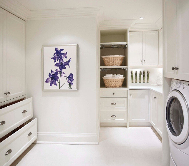
Image via Homebunch
PURE WHITE by Sherwin Williams
This is a great soft white. Though its name says “pure” it does have a hint of warmth to it. However, it is not as creamy of some of the others on this list which makes it very versatile as a white with no cool undertones.

Image via Homebunch
SIMPLY WHITE by Benjamin Moore
I’ve used this in dining rooms, bathrooms, bedrooms…you name it! It’s a great warm white that almost glows and doesn’t read too yellow. If White Dove is too creamy for you, but you don’t want a stark white, this may the one!

Image via Homebunch
SNOWBOUND by Sherwin Williams
Snowbound is a white with some beige and grey undertones. I do find that it pulls a little more grey compared to some of the warm whites on this list, making it appear a little more bright and a little less creamy.

Image via Homebunch
WHITE DOVE by Benjamin Moore
I have used this color on all my trim and kitchen cabinets in the last house. Here’s the thing with this color, it is a very pretty warm white. It has both beige and gray undertones, but pulls a little more beige, making it feel like a timeless white. However, I have had clients select this color and Alabaster (below) to go with their tan backsplash, thinking it would look really creamy on their cabinets, and it looks much more bright white than they were thinking. Pairing this with anything brown instantly makes this color feel more bright because it is not an off-white.
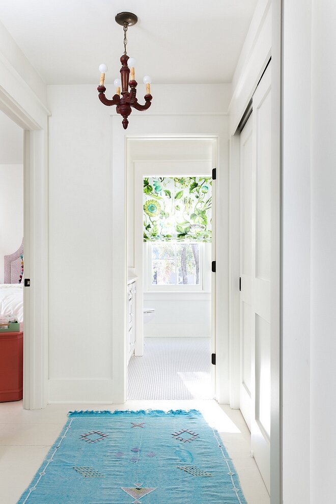
Image via Homebunch
ALABASTER by Sherwin Williams
This is the closest comparable, from Sherwin Williams, to White Dove and my most requested white from clients. Like the color above, it has undertones of beige and gray, though it leans more beige. It is a beautiful warm white!
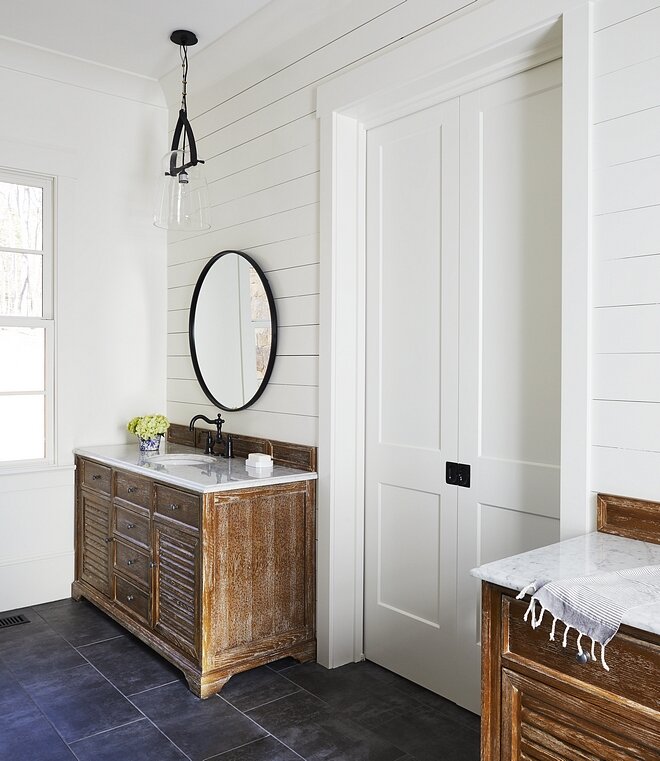
Image via Homebunch
SWISS COFFEE by Benjamin Moore
The creamiest of all the whites on this list; this can read yellow in some lighting because it doesn’t reflect light as much as the other whites. I am using a comparable to this in our current home because of the natural glow it gives off that almost feels European.

Image via Studio Mcgee
Stay tuned in all of this week and next for more spring refresh tips and sources:
April 1- Office Organization
April 2- Black Paint Colors
April 5- Closet Organization
April 6- Gray and Putty Paint Colors
April 7- Toy Organization
April 8- Blue Paint Colors
April 9- Our Favorite Rugs
April 12- Green Paint Colors
April 13- Our Favorite Wallpaper
April 14- Our Favorite Art
April 15- Our Favorite Accessories
April 16- Outdoor Update
Enjoy,
Nikki