
Spring Refresh | Gray and Putty Paint Colors
Today, let’s tackle gray and putty paint colors. I originally had an entire post for each of these, but let’s be honest, there are enough gray color guides to go around. Along with that, every client that I consult knows what gray all of her friends have. Safe to say everyone is pretty well-versed in gray colors, but they are moving into warmer tones….sometimes called greige, putty or mushroom. I’ll try to cover the newer options along with a few of my favorite, classics.

CLASSIC GRAY by Benjamin Moore
This is a timeless gray, in my opinion. It has a good amount of warmth to it so it can almost appear beige in some lights. It is a very light gray so I have even had clients question if it was white. With popularity moving towards white paints, it would be a middle-ground.

Image via Homebunch
HALO by Benjamin Moore
Another pale gray that can almost look white, this color has some warmth and sometimes a tint of green to it. It can have a historical feel. I used this all over my last house and it would change color depending on the colors around it. Based on the season just outside the windows, it would look warmer, true gray, or green/gray. It made it a really versatile color.

Image via South Meets Lake Project
REPOSE GRAY by Sherwin Williams
A great mid-tone gray that has warmer undertones. This gray is another versatile one that can look different based on the colors around it. If you’re nervous about beige or going too light, this is a safe gray to go with.

Image via Jenna Kate At Home
CHELSEA GRAY by Benjamin Moore
A deeper warm gray with a slight green undertone. This is another versatile gray that can be used when you’re wanting something a little more rich. This gray would pair well with white trim and cabinets to create a high contrast look without going black.

Image via Laurel Bern Interiors
DOVETAIL by Sherwin Williams
Another rich, warm medium gray. This gray borders on charcoal to give a moody, masculine look that makes white trim pop.

(CABINETS) Image via Homebunch
KENDALL CHARCOAL by Benjamin Moore
A dark gray with some green undertones, this gray gives a rich depth to any room it is painted with. This color would work well in modern and traditional spaces.

Image via Homebunch
SEAPEARL by Benjamin Moore
This color can either be considered a light greige/mushroom or warm, off-white. If you’re wanting a white that isn’t stark white, or a slight gray tone without it looking like the grays of the 2000’s, this may be the color for you. It has a creaminess that isn’t too creamy, just a bit of softness. This color looks great with blacks, bronzes, dark woods, and whites.

Image via Remodelista
PALE OAK by Benjamin Moore
A warm, neutral almost white that gives the space a soft glow. The warm undertone in this color can sometimes give the color a pink shade in certain lights, so test out before using. In low lighting this can look more greige, whereas, in more natural light this looks like a warm white. This color looks great against blacks, bronzes, and dark woods.

Image via Remodelaholic
BALBOA MIST by Benjamin Moore
A soft warm gray that can coordinate with almost any room. This grey may be the definition of the term “greige”, though it does have some green and pink undertones. This is another one that can turn colors depending on the lighting, so test out before committing to the whole room.

Image via Hideaway
PASHMINA by Benjamin Moore
A putty “greige” that is slightly warmer than popular grays like Revere Pewter. This color is a great rich, neutral to use when you’re wanting to start moving away from gray. There are some slight green undertones that can arise in certain lighting. If you’re wanting warm mushroom cabinets, this color would be perfect!
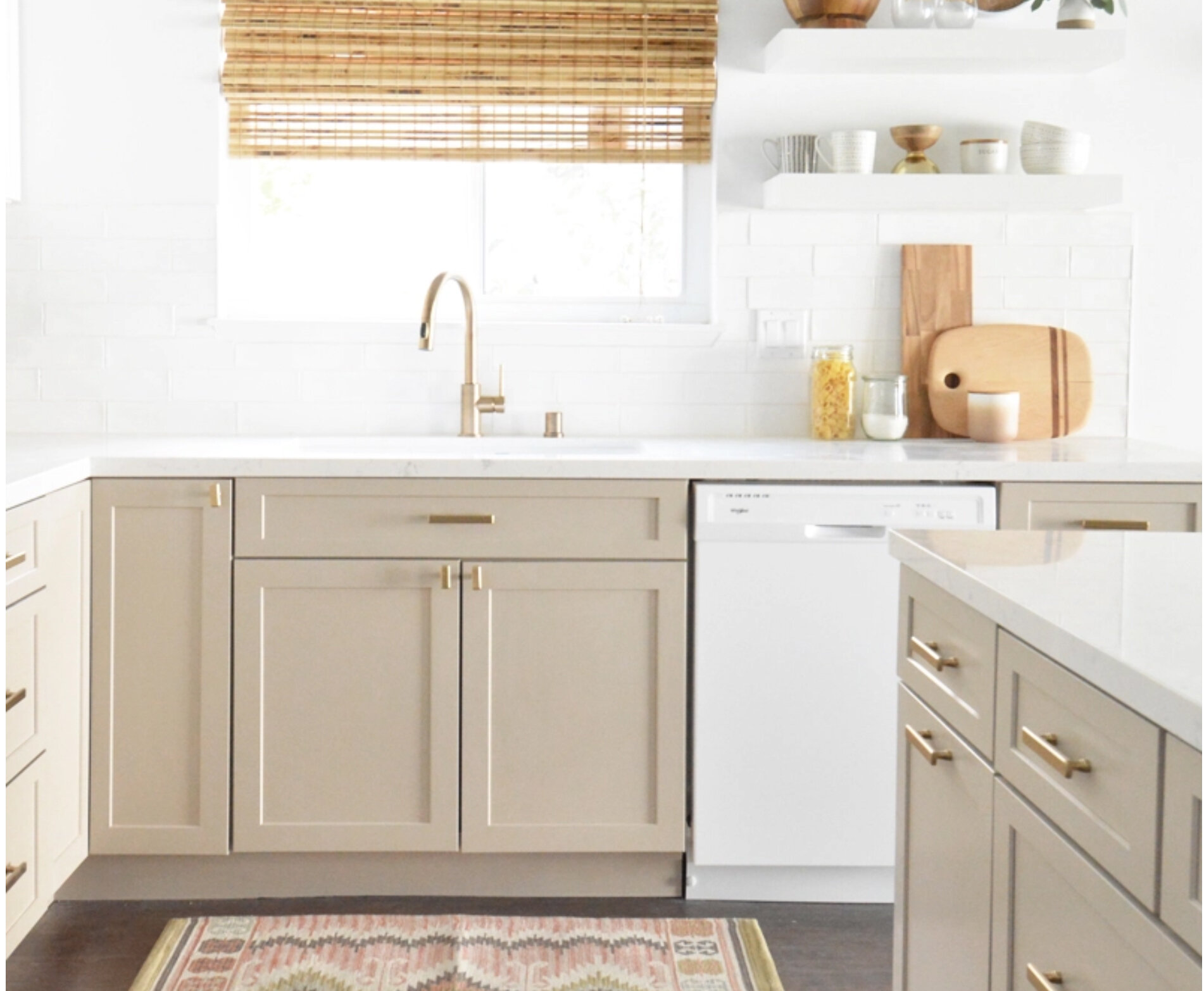
Image via Censational Style

Image via Claire Jefford
ADAPTIVE SHADE by Sherwin Williams
A deeper putty color that still has a slight gray undertone. This color is rich and would look great on walls and cabinets against white trim and countertops. This color has also been a great choice for traditional exteriors.

Image via At Home With The Barkers
Tomorrow, we are diving into our kid’s spaces and finding better options for toy storage.
April 7- Toy Organization
April 8- Blue Paint Colors
April 9- Our Favorite Rugs
April 12- Green Paint Colors
April 13- Our Favorite Wallpaper
April 14- Our Favorite Art
April 15- Our Favorite Accessories
April 16- Outdoor Update
Enjoy,
Nikki