
Spring Refresh | Blue Paint Colors
Blue has almost become a neutral in many households, nowadays. Navy islands paired with white cabinets are timeless and grays with blue tones have become the “blue” for clients who don’t want to commit to saturated colors. Today, we are covering some of our favorites, though it was tough to choose!

SEA SALT by Sherwin Williams
This light blue-green is very coastal inspired which is telling by the name, alone. It feels fresh and airy. This is definitely a color chameleon that can either be gray, blue or green depending on the light so make sure to test it in your space.

Image via Homebunch
WOODLAWN BLUE by Benjamin Moore
This versatile light blue is serene and tranquil. While I refer to it as a blue, it does have a green undertone and can be a chameleon depending on the amount of natural light that it receives. In more natural light, the blue becomes more vibrant, while with less it appears more gray.

Image via Old Seagrove Homes
STARDEW by Sherwin Williams
This muted light to mid blue is a great “neutral” that would look good on cabinets and walls. It has a lot of gray to it which makes it a cooler tone that can pair well with warm accents.

Image via Sherwin Williams
BOOTHBAY GRAY by Benjamin Moore
This is another gray-blue color that I have used when clients don’t want a saturated blue but want a color that feels blue. This one is a little more mid-tone, and works great on cabinets, doors, and walls.
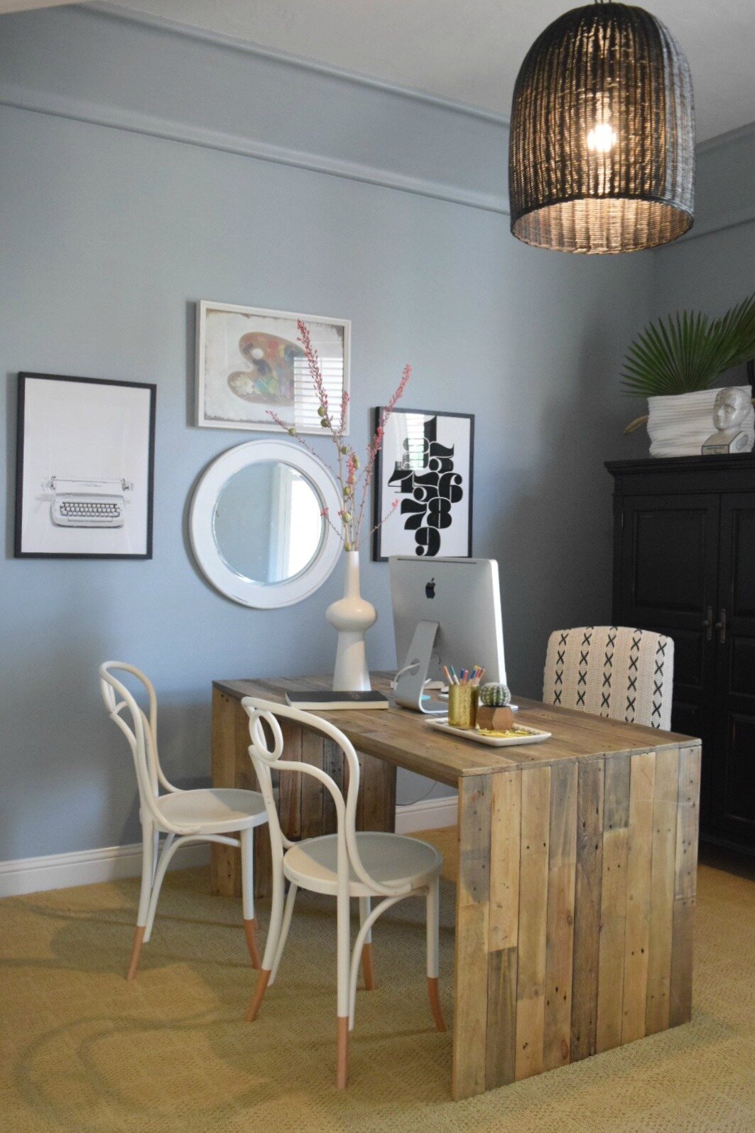
Image via Nesting With Grace
POLARIS BLUE by Benjamin Moore
This mid-range blue is absolutely beautiful on cabinets! It has a slight gray undertone that helps to cut the saturation a little. It feels both fun and classic at the same time.

(CABINETS) Image via Studio McGee
GENTLEMAN’S GRAY by Benjamin Moore
A deep, rich blue that could be considered a navy. It is pretty saturated and does have a teal appearance in some lights.

Image via Gathered Living
HALE NAVY by Benjamin Moore
This is probably the most used blue over the past few years. It is a very dark and sophisticated navy with undertones of warmth and gray. For those who want a deep navy with drama but not too competitive with other colors, this one is a no-fail color. I have used this on islands, dining rooms, pantry cabinets and walls…everywhere!

Image via Remodelaholic
NAVAL by Sherwin Williams
This deep navy is a versatile blue with warm tones to give it balance. Sherwin Williams describes it’s references as being the sea and the night sky. Maybe that’s why this saturated blue still feels very natural. It looks amazing for dramatic walls or cabinets.

Image via Architectural Digest
Tomorrow, we kick off our shoes and talk rugs to celebrate Friday!
April 9- Our Favorite Rugs
April 12- Green Paint Colors
April 13- Our Favorite Wallpaper
April 14- Our Favorite Art
April 15- Our Favorite Accessories
April 16- Outdoor Update
Enjoy,
Nikki