

Spring Refresh | Green Paint Colors
I love a green paint to bring “nature inside” the home. It can feel fun and playful, relaxing, boho, or sophisticated.
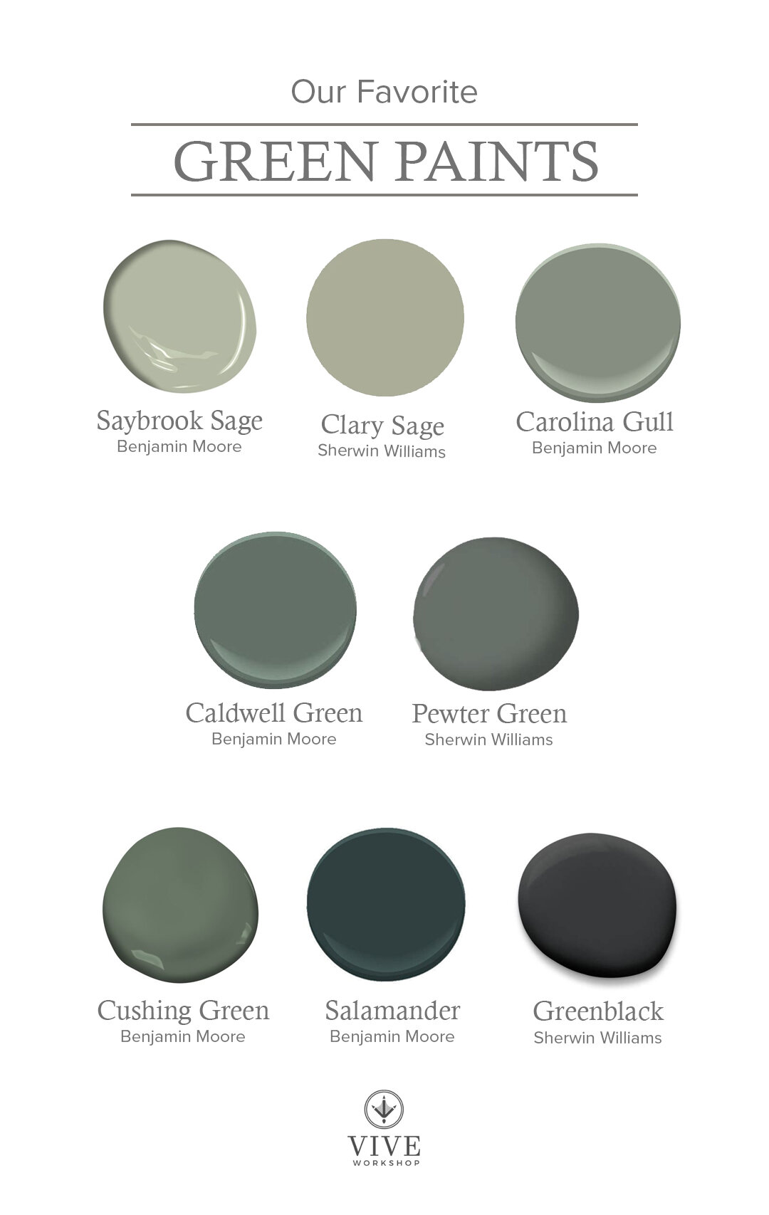
SAYBROOK SAGE by Benjamin Moore
A soft sage green that will always be a timeless classic. There is a gray undertone that dulls out the green, but also has some warmth to it. This color pairs well with fresh whites, grays, yellows, and even pinks in a girl’s room. Here it is paired with Chantilly Lace.

Image via South Meets Lake Project
CLARY SAGE by Sherwin Williams
This is another sage green that has undertones of gray and warmth. This color looks great on cabinets with fresh white countertops and backsplash.

Image via Blesser House
CAROLINA GULL by Benjamin Moore
This muted mid-tone green that is a soft backdrop to any room. This color has an undertone of gray and could also be considered a sage.

Image via Pennies for a Fortune
CALDWELL GREEN by Benjamin Moore
This mid to dark green had undertones of gray and blue. The green has an olive hue and would look great against whites, blacks, and wood tones.

Image via Studio Mcgee
PEWTER GREEN by Sherwin Williams
Another cool sage-y green…apparently I’m drawn to them. This deep green has a bit of blue in it that brings out a rich teal vibe, giving you a sense of pine trees. This color pairs with whites, neutrals, golds, blacks, and warm woods.

Image via House Beautiful
CUSHING GREEN by Benjamin Moore
A rich warm green that can add a punch to any room. I love this color when mixed with brass, white and black.

Image via Design Chic
SALAMANDER by Benjamin Moore
If you want a green with drama, this may be the color for you! This deep green has a hint of blue which makes it feel like a hunter green. It’s another one that looks great with whites, blacks, and cognacs.

Image via Apartment Therapy
GREENBLACK by Sherwin Williams
When you are feeling bold, but don’t want a true black this is a great alternative. It has a slight green undertone which makes it feels a little more natural and warm. It feels sophisticated and and moody, and is a great contrast against white.

Image via Studio Mcgee
Tomorrow, we have a little fun with our favorite wallpaper!
April 13- Our Favorite Wallpaper
April 14- Our Favorite Art
April 15- Our Favorite Accessories
April 16- Outdoor Update
Enjoy,
Nikki