


South Meets Lake- Cottage Tour- Part 3
At the beginning of the year, I shared part 1 and part 2 of the #VWSouthMeetsLake Cottage Tour. It's safe to say that these last two rooms are long overdo. If you've missed or forgotten what the cottage looked like, simply click on the links above. Honestly, posting about this cottage in the summer time seems much more fitting. There are traces of the water, nature, and nautical life throughout this cottage. The main color scheme of the house is blue and green, but accents of warm tones run through-out, as well.
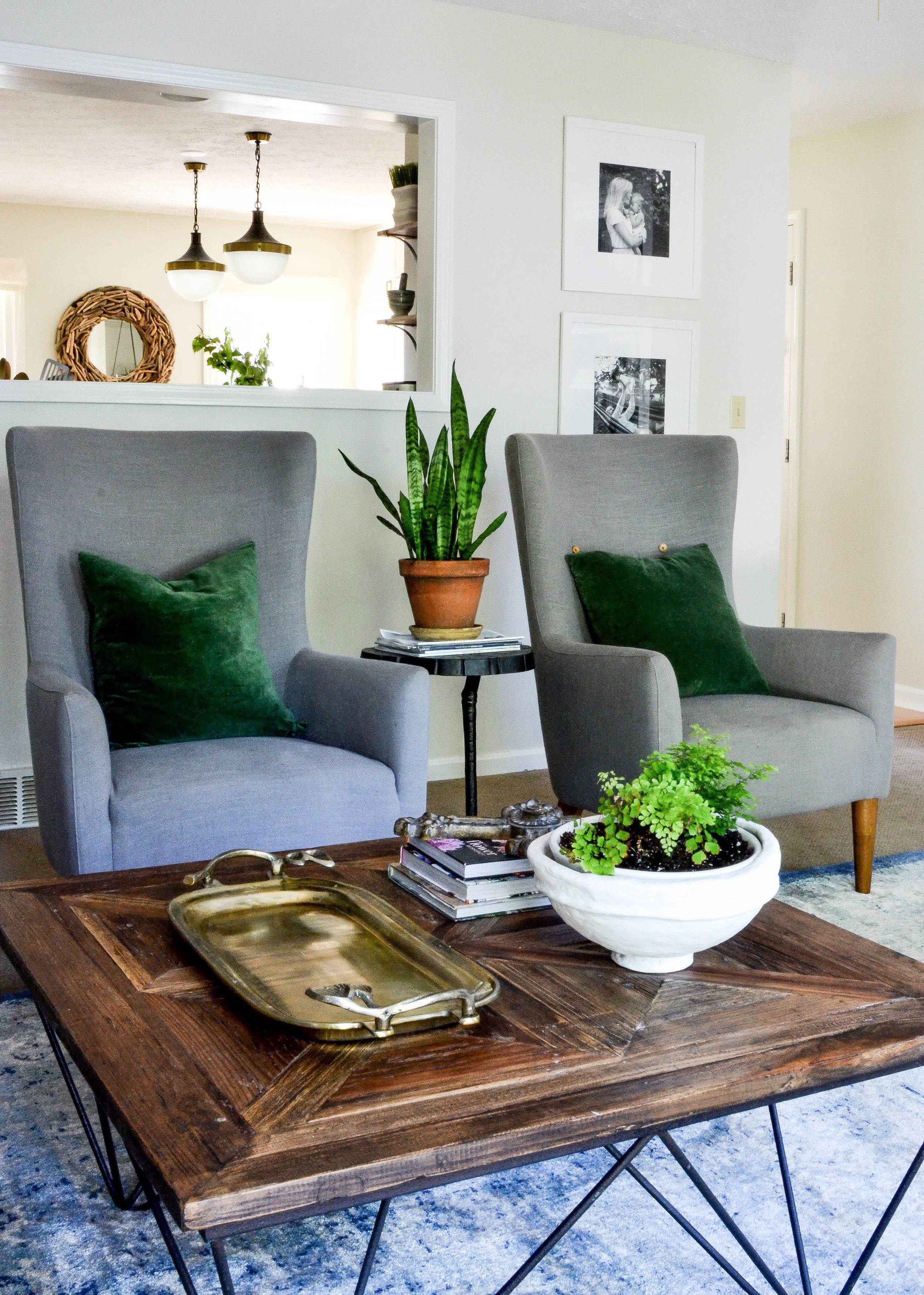
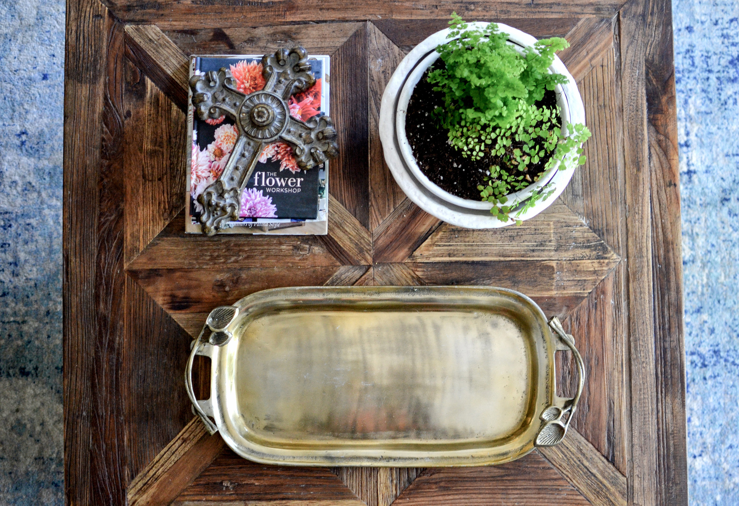
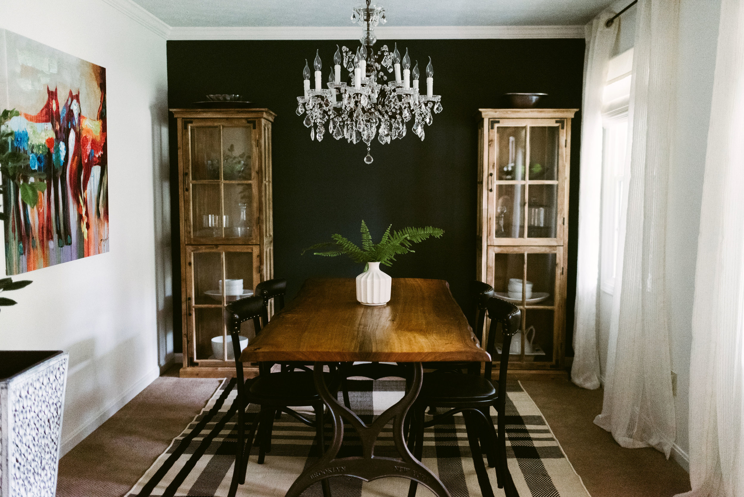
The family room is right off of the kitchen and overlooks the backyard. This room gets the best light in the house, so it's where the majority of the plants reside. The family spends most of their time playing and relaxing in this room. I wanted it to have some southern charm so I used a coffee table with a rough wood finish, antique accents, a chesterfield sofa, and a large picture of a live oak tree over the sofa. Just like every other room in the house, nothing is too precious. I mixed materials and patterns to create interest, but also so that if something ever needs to be changed out, it can be done without making it look like a piece of a "set" is missing.

Photo from real estate listing


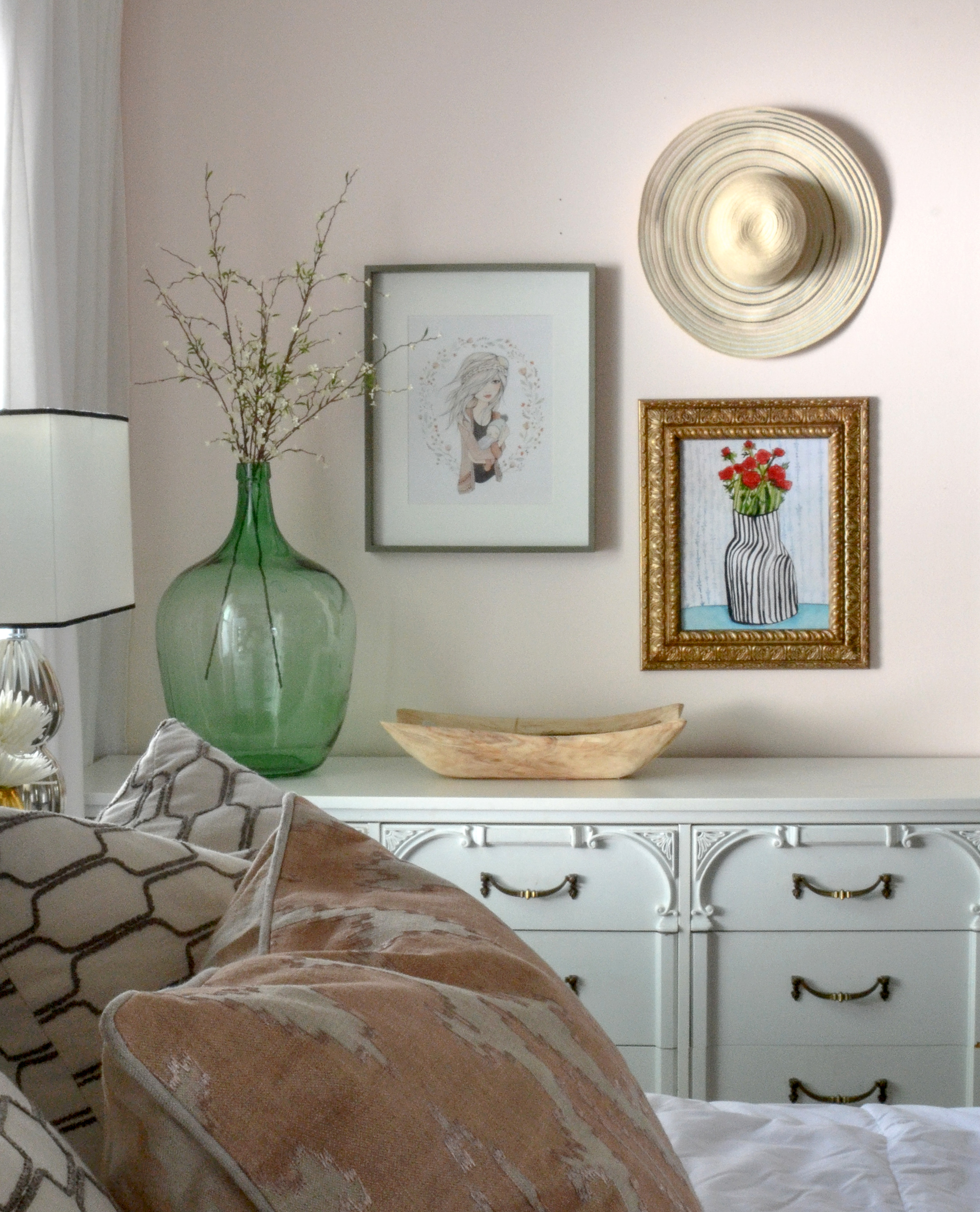
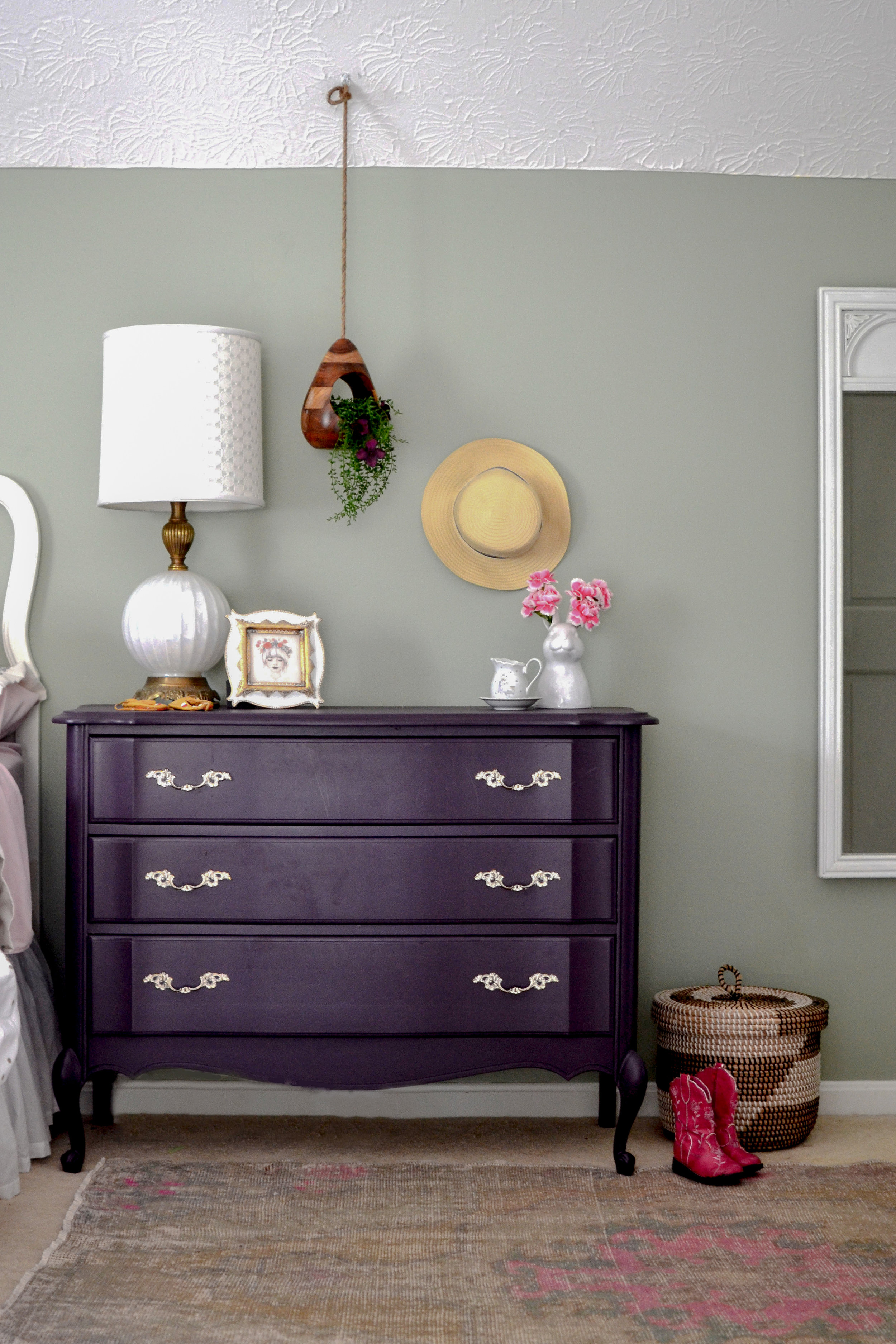
The Master Bedroom is next to the family room. This room has a window, doors to the bathroom and backyard, and large closet doors which leaves very little wall space for furniture. Any furniture that was used needed to feel light and fresh so that the room wouldn't feel weighed down. Along with that, I wanted to use a paint color that would bounce light and still give the room a calming feeling. I went through so many paint color samples and NOTHING I had used before felt right. I finally landed on pink, of all colors. Getting the correct shade of pink was crucial to make sure it would not feel like a baby girl's nursery.

Pink can really intensify once it's covering the walls, but this pink feels like a warm, glowing sunset over the water. I combined it with accents of black, blue, and green to pull it a little more towards the masculine side.


I hope you’ve enjoyed this home tour. To get more design inspiration follow me on instagram and pinterest.
Nikki

Bay Dream Kitchen Reveal
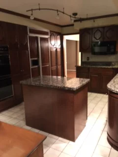
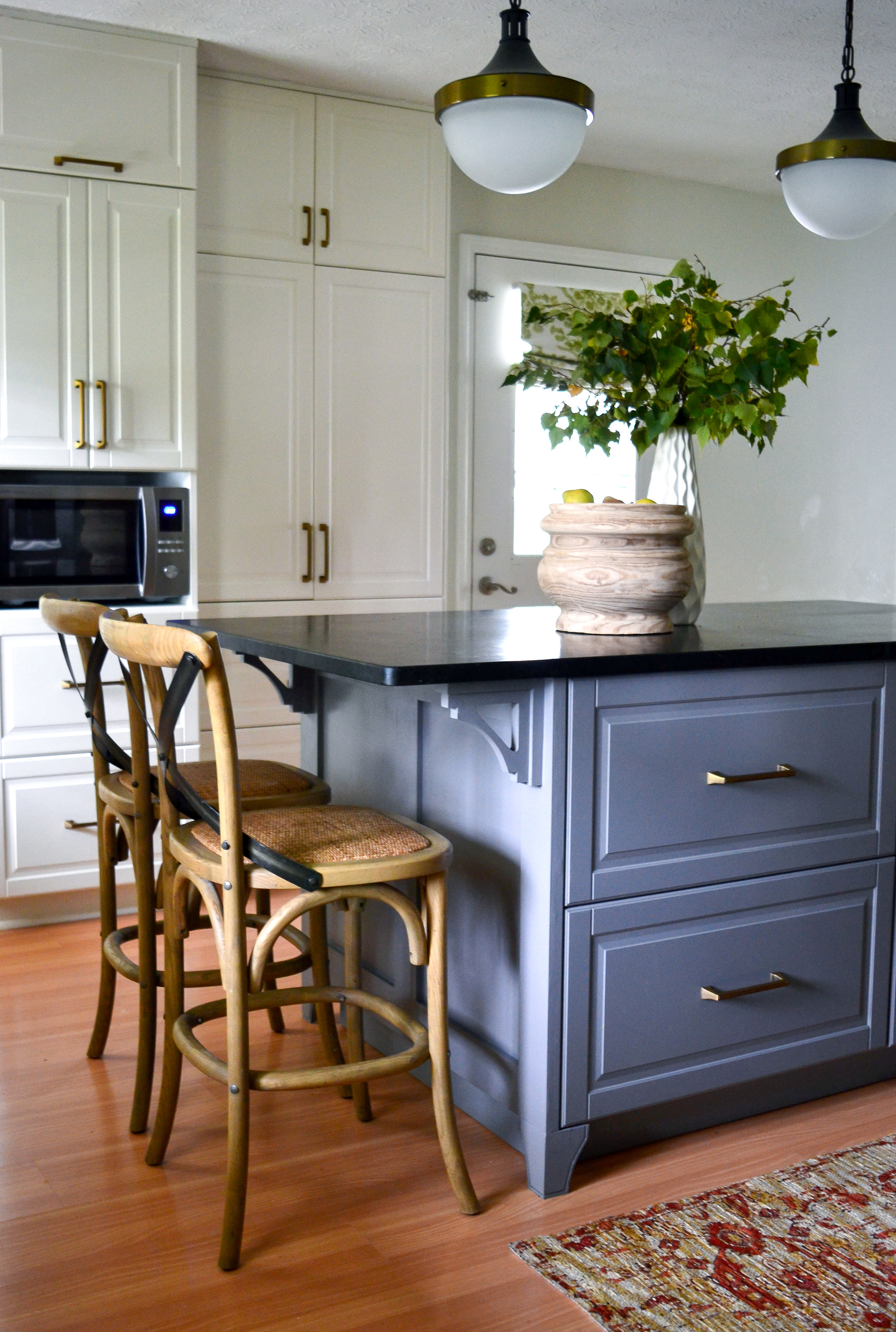
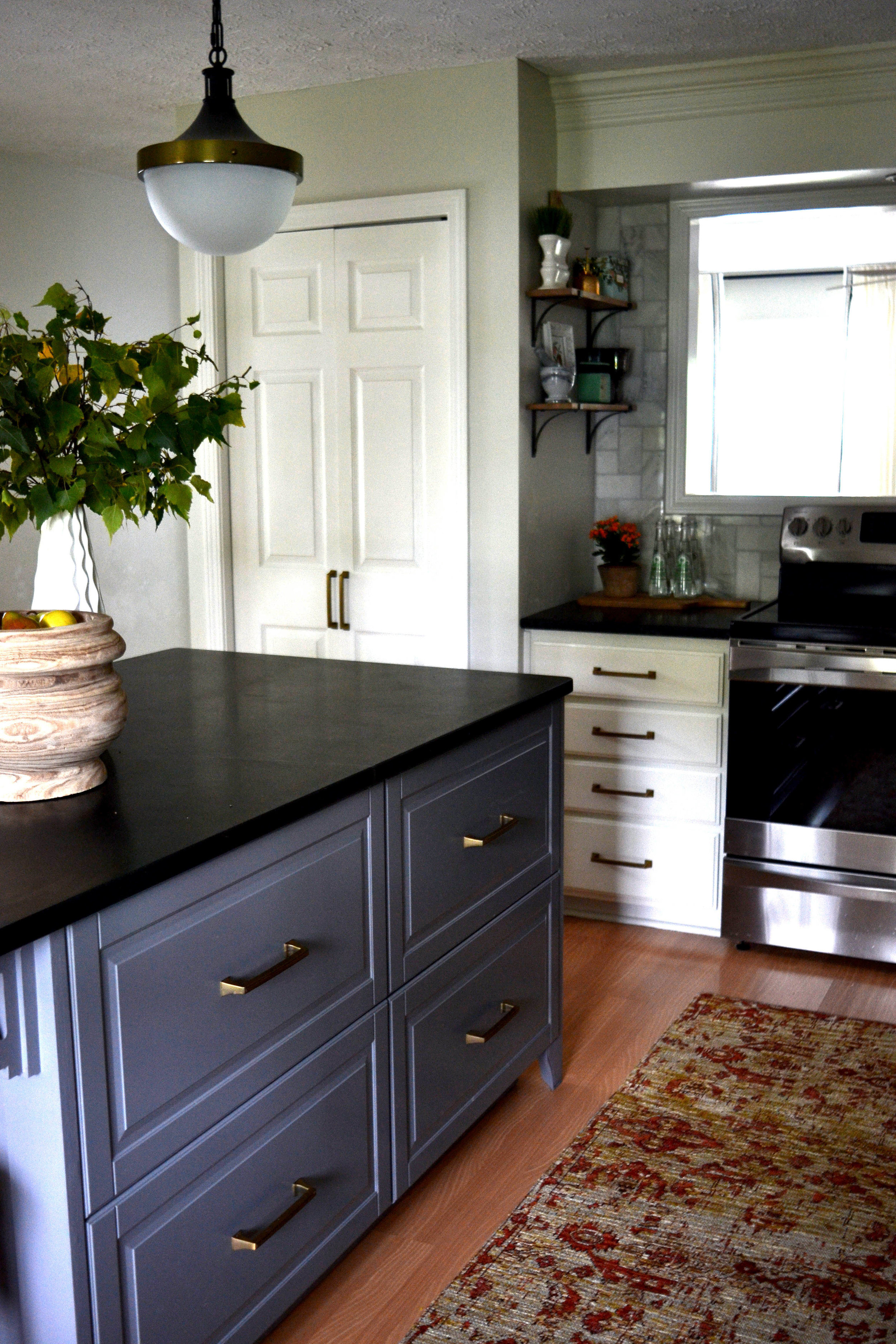
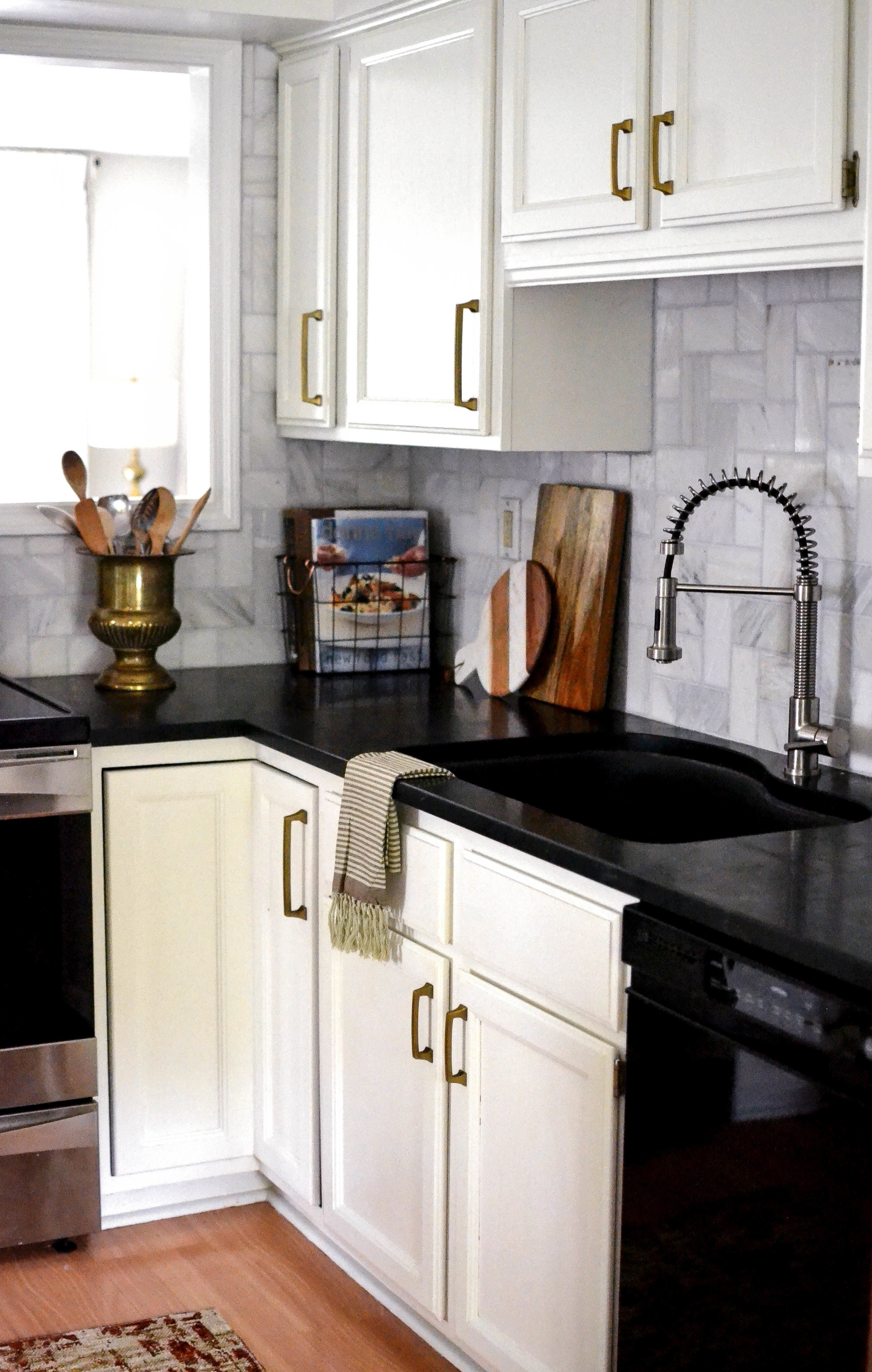
Last fall, I was contacted to help bring a family's vision of their dream kitchen to life. They had moved into their home a couples year earlier, knowing that they would eventually redo the dark and dated kitchen. Not only was the kitchen dark, it also wasn't functioning well for a young, busy family. The table where they had most of their meals was next to the family room (behind the kitchen), there was a formal dining room next to the kitchen, and a formal living room in front of the kitchen and dining. With three young kids they wanted to take advantage of all unused the space.
Here's the before:

View from family room

We decided to open up the wall between the existing kitchen and formal dining room to create a large kitchen. We also removed the load bearing wall between the kitchen and family room to allow for more light and give the area a better flow. I designed a large island that seats the entire family and stretches across the kitchen. The two columns that take the place of the wall line up with the island, and a large wooden beam that coordinates with the vent hood runs the length of the kitchen to give the impression of separation from the family room.
The homeowners wanted a timeless kitchen that was mostly white, but that had an "organic and farmhouse" feel. They had a a sliding barn door with a diagonal trim piece, in their family room, that we took inspiration from for the island detail. The combination of white and wood grain always feels so balanced and timeless. Details like the vintage runner, patterned wallpaper on the back of the glass cabinets, and greenery added to the organic feeling.
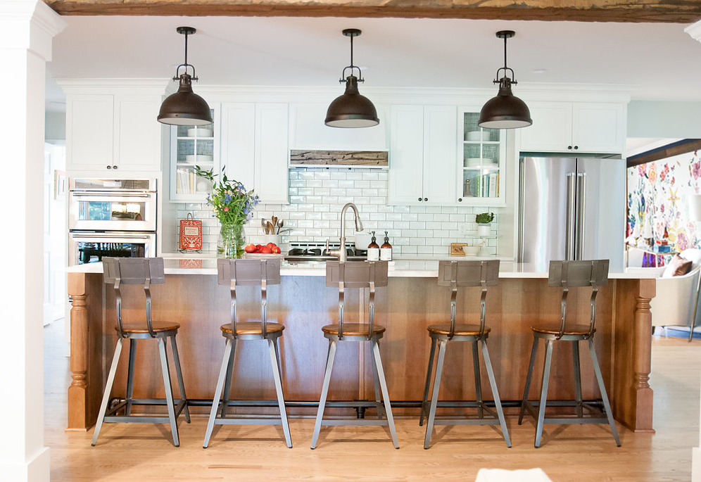
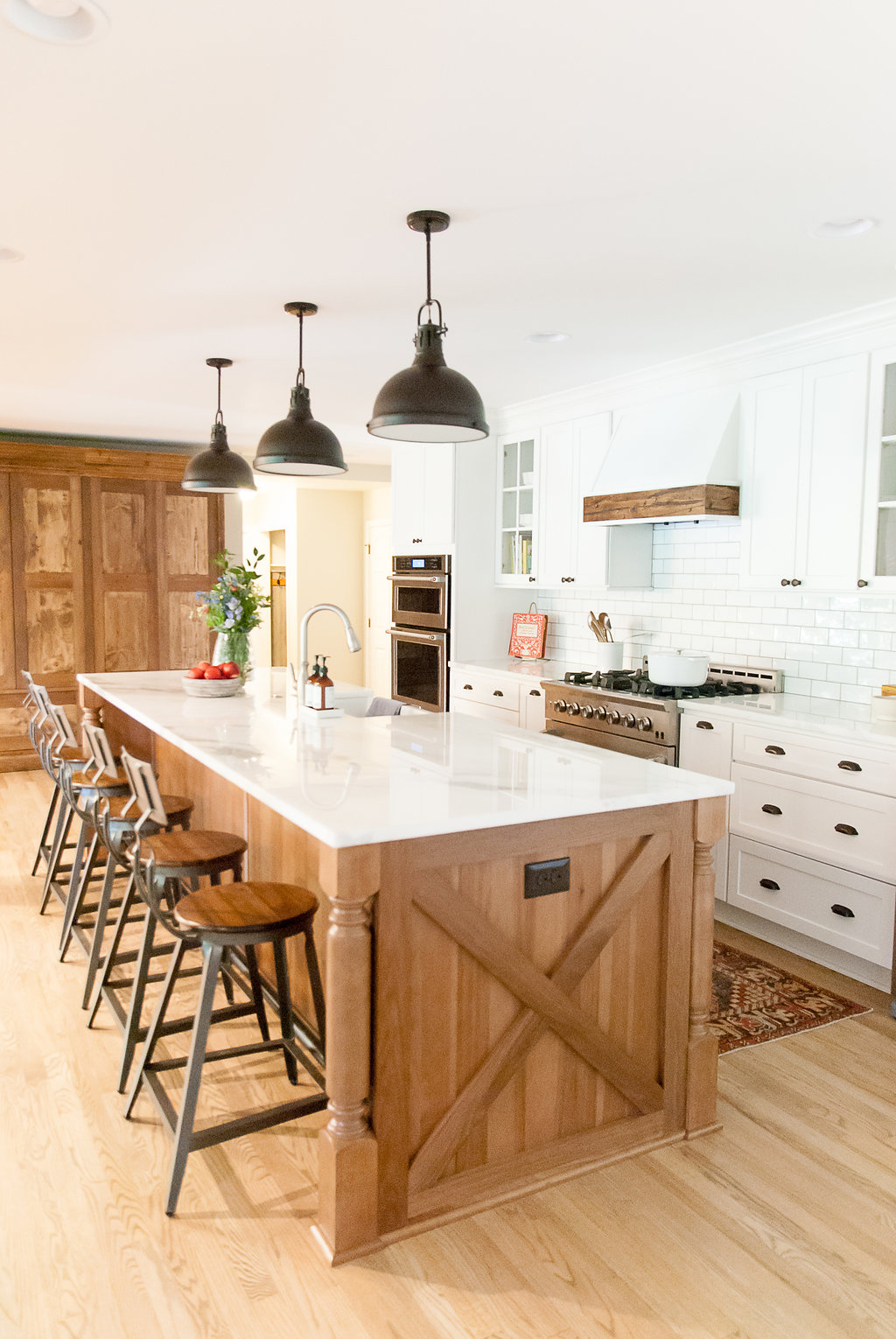


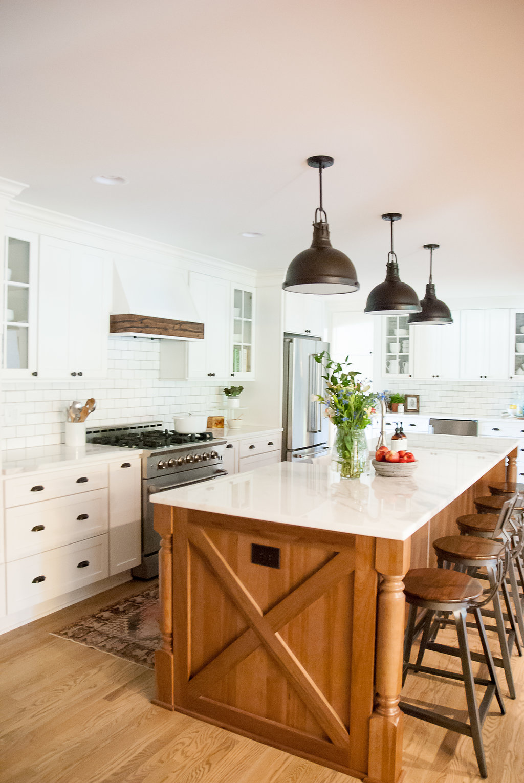
Photography: Sweet Magnolia Photography
Contractor: Bennett Builders

South Meets Lake- Cottage Tour- Part 2
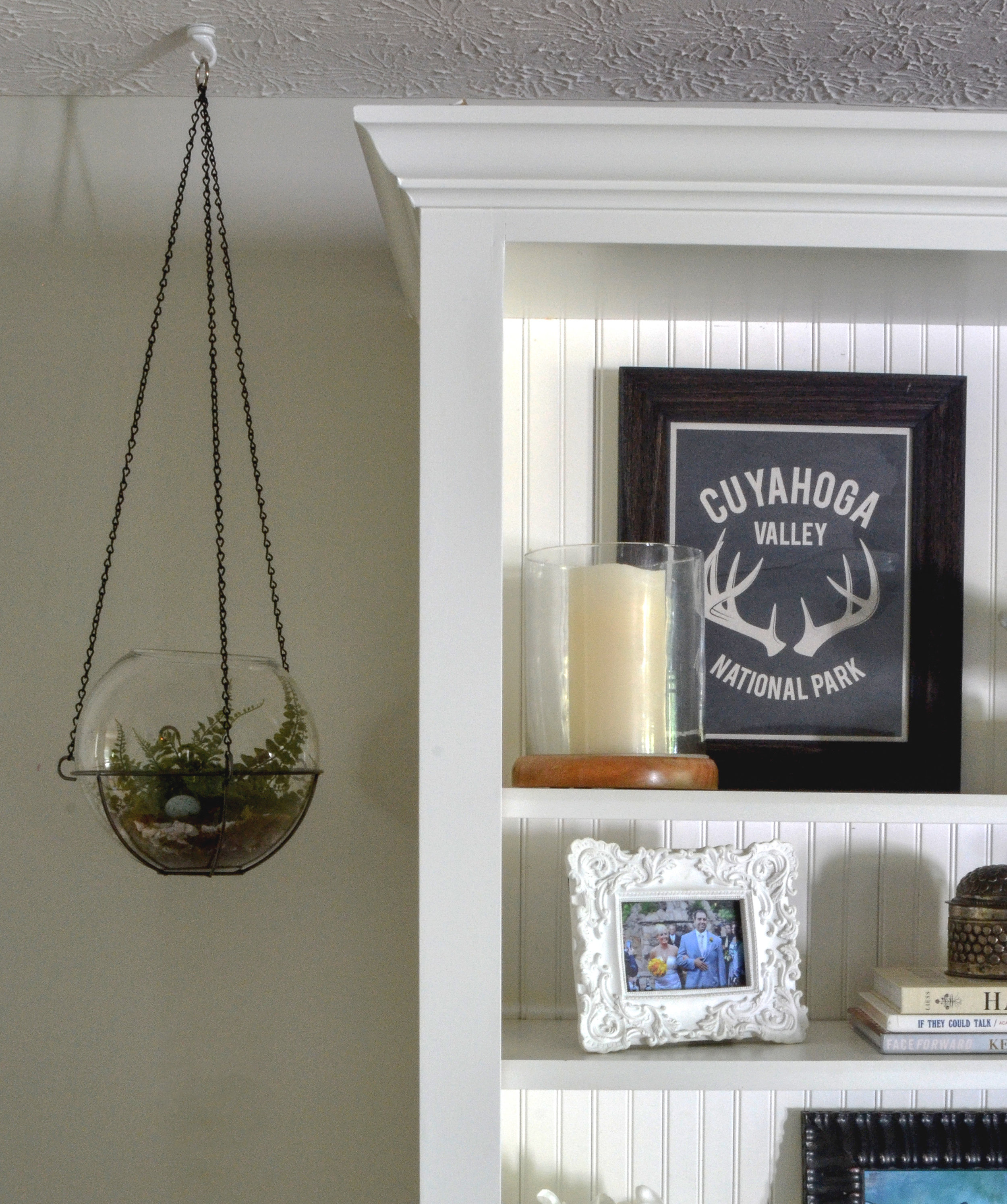
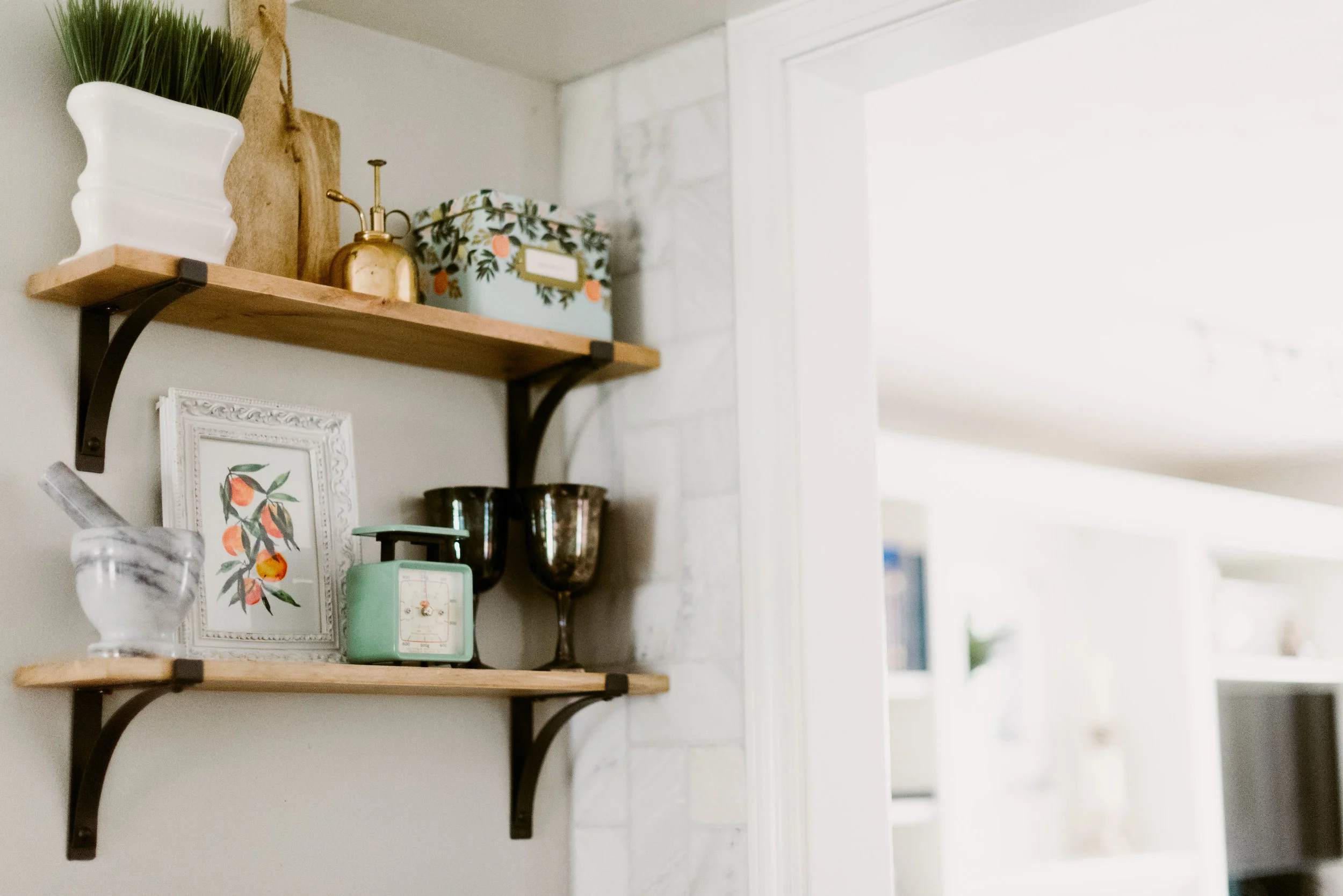
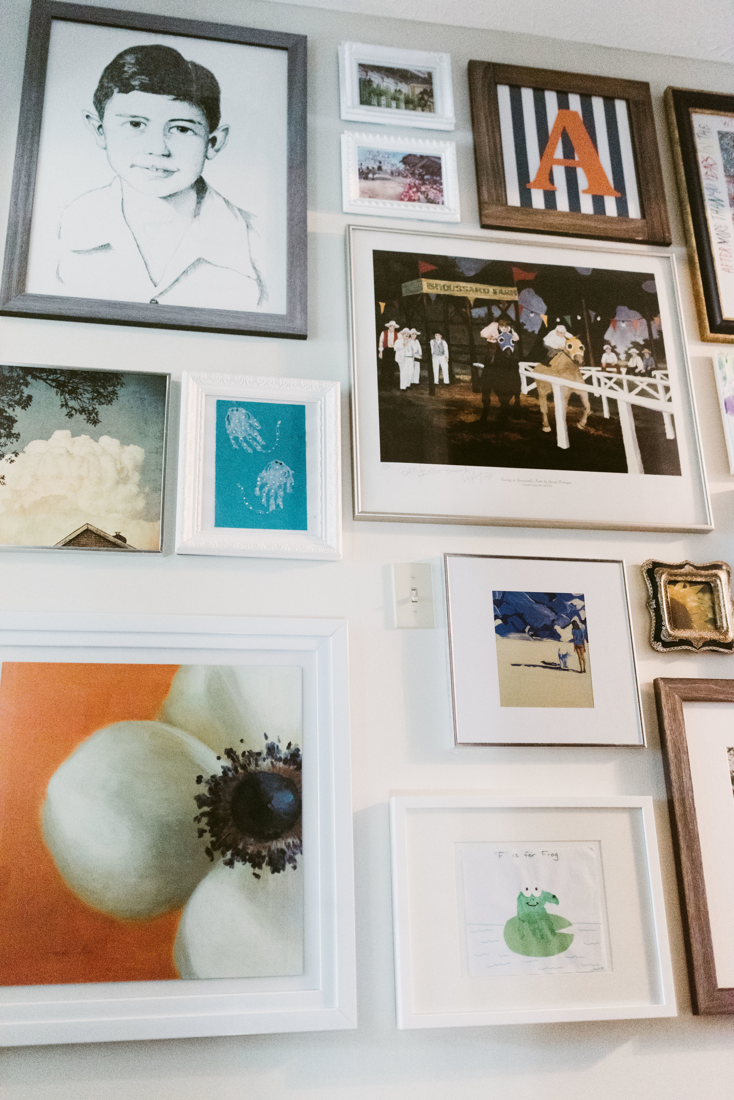
Today, I'm sharing part 2 of the #VWSouthMeetsLake cottage tour. I showed images for the entry, dining, powder bath, and the kitchen in part 1. Now, I'm taking you to the second floor of the house. The stairway is across from the entry, so you can see a glimpse of the small hallway when you walk into the house. I wanted it to spark some interest and give a hint of the fun that happens upstairs (the kid's area). I arranged a large collage of art collected over the years and included art done by the kids.

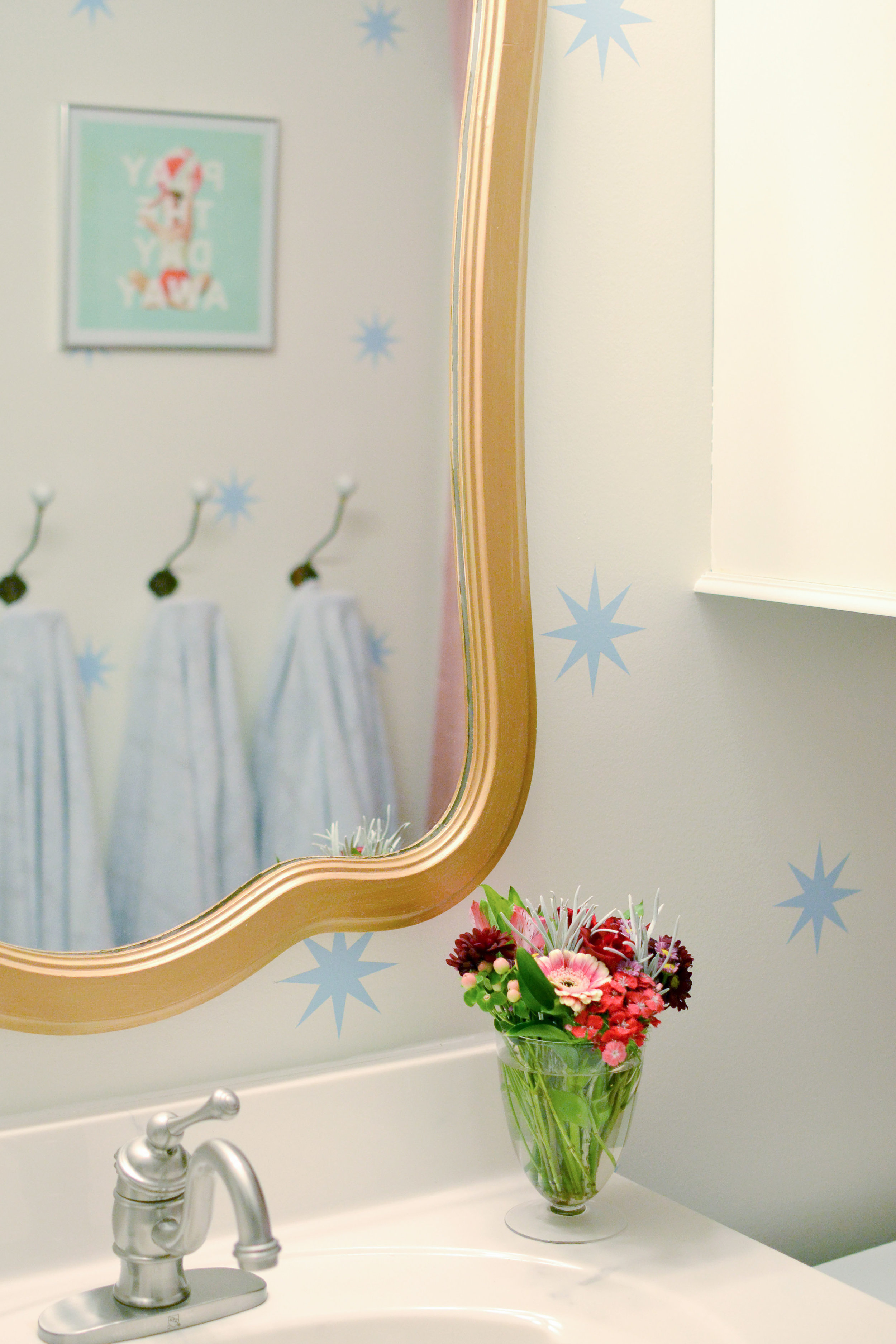
The kid's bathroom didn't change too much. A new mirror, wall hooks, updated paint, and wall decals refreshed the room and made it feel like a fun space. Small bathrooms are great places to add pattern to walls (decals or wallpaper) because the small area is better for your budget and is not as big of a risk as an entire, large room. So if you want to make a statement somewhere, but are a little nervous, start with a bathroom.

Before Bathroom
After

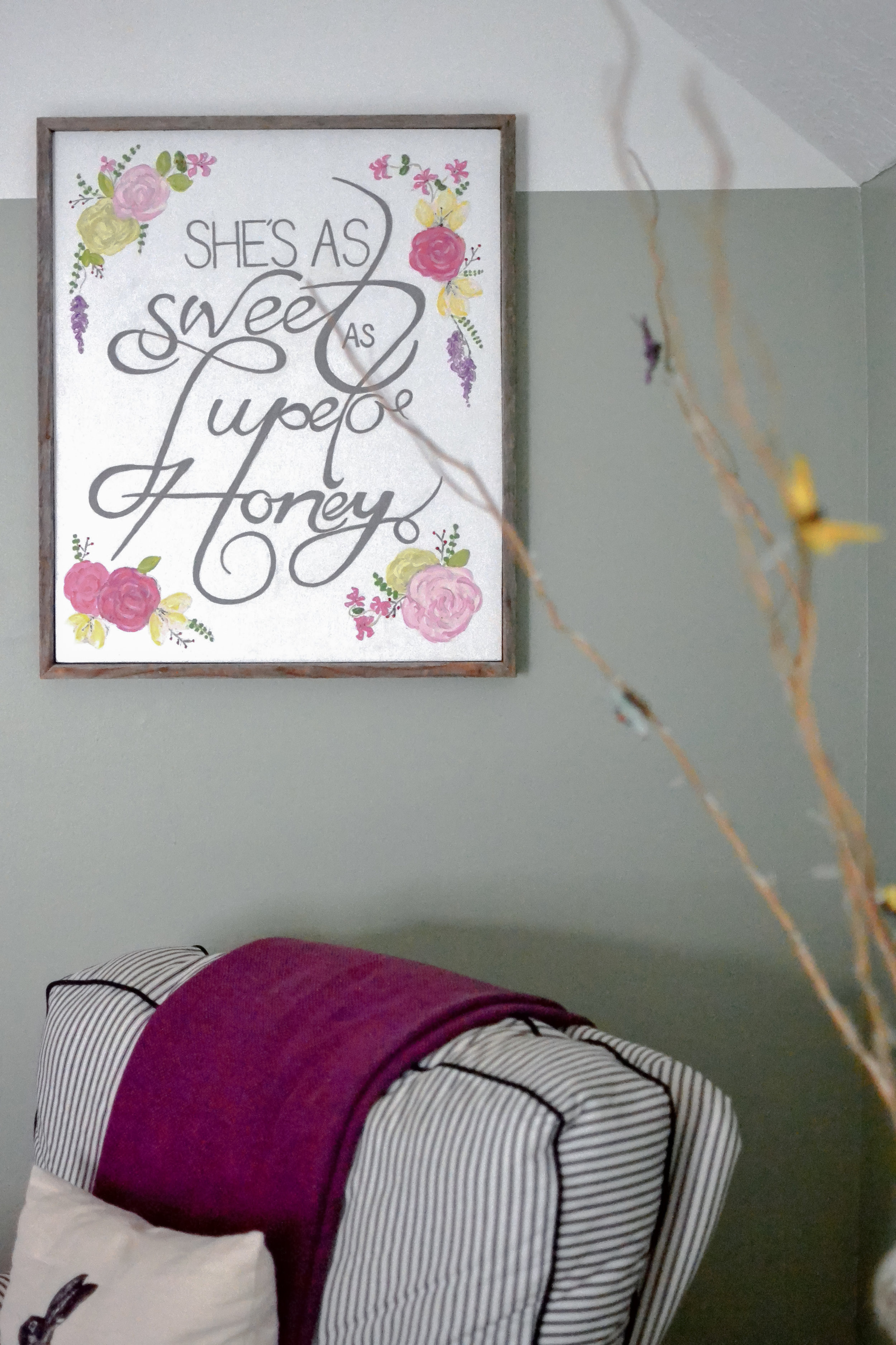
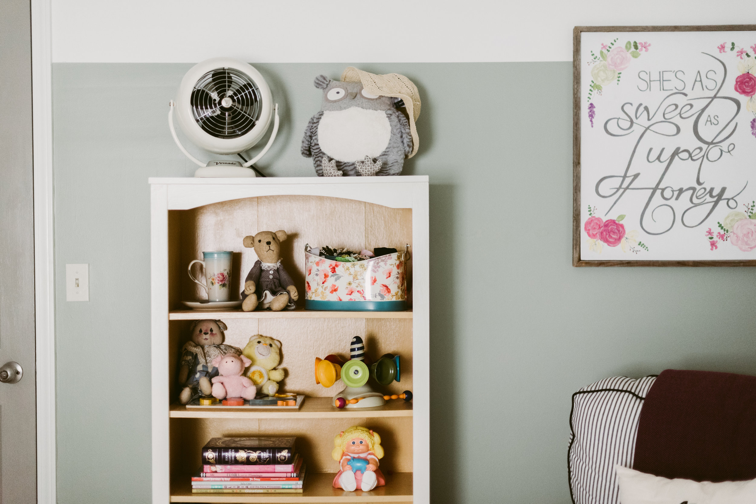
The little girl's nursery is a HUGE room, so arranging the furniture to fill the space but not letting it get too cluttered was a challenge. I used a rug and furniture groupings to create different "sections" in the room. I wanted to keep the walls gender neutral in case the kids share a room in a couple years, so I added the girly touches through textiles, furniture, and accessories. The furniture was re-used from 3 different spaces, but it was key to try and keep the lines similar.


Before Pic
The before picture shows just what a big difference paint can make. The color-blocking paint trend is also a great way to de-emphasize the diagonal ceiling/wall in an upstairs space. Make sure the "break" in color starts at the bottom of the diagonal and continues throughout the room.

Guest Bed
I separated the dormer area with a textured, sheer curtain to created a little play space and reduce the scale of the room.
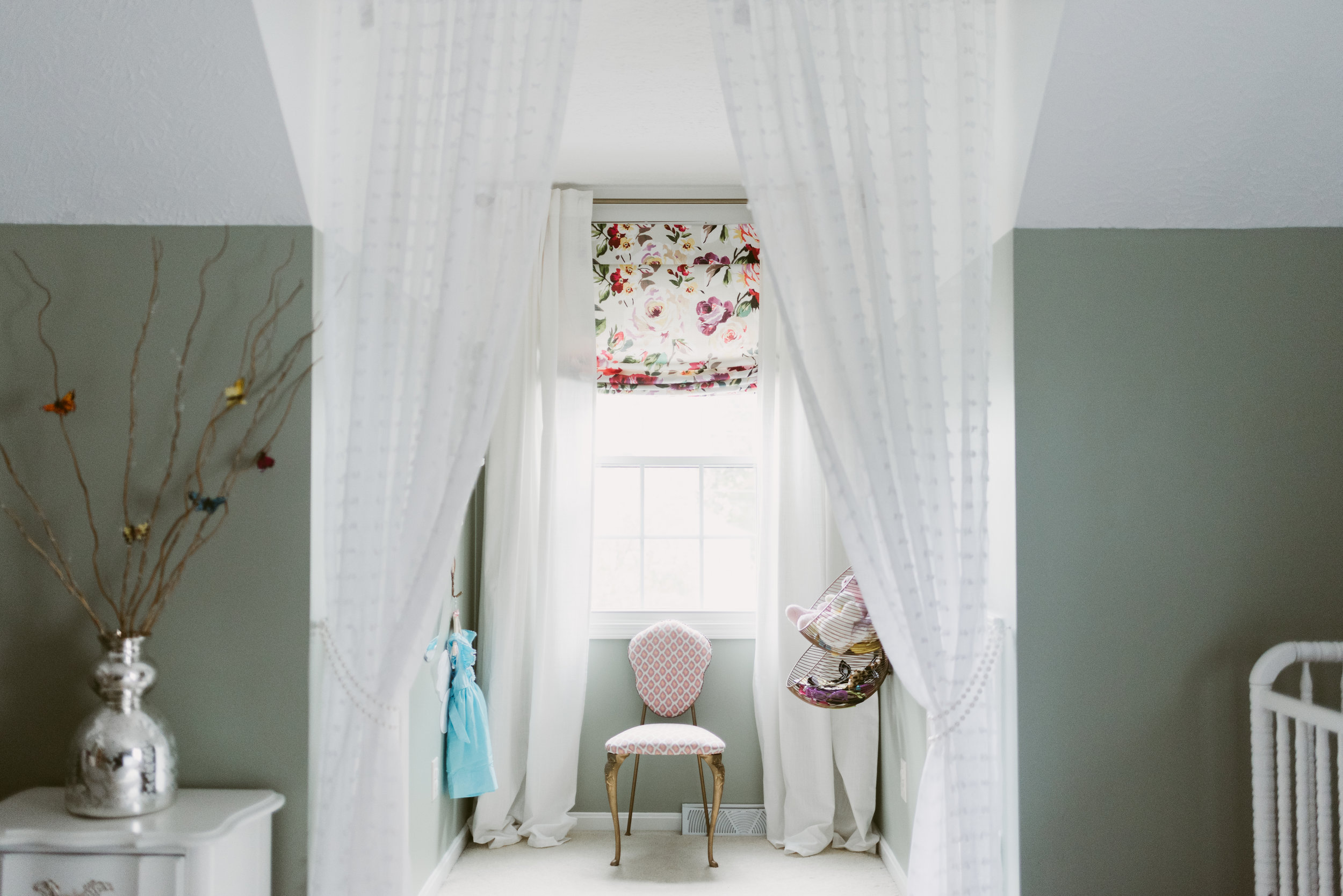
Dormer Window

Both kid's rooms have attic access doors that originally were flat panels that had screws to close them. We updated the look of the doors and added hinges so they would open as doors. One of the attic spaces has wired lights and connects the rooms. We have started adding carpet squares and chalkboard walls to create a little playroom/hide-out area. I will share when it is finished.
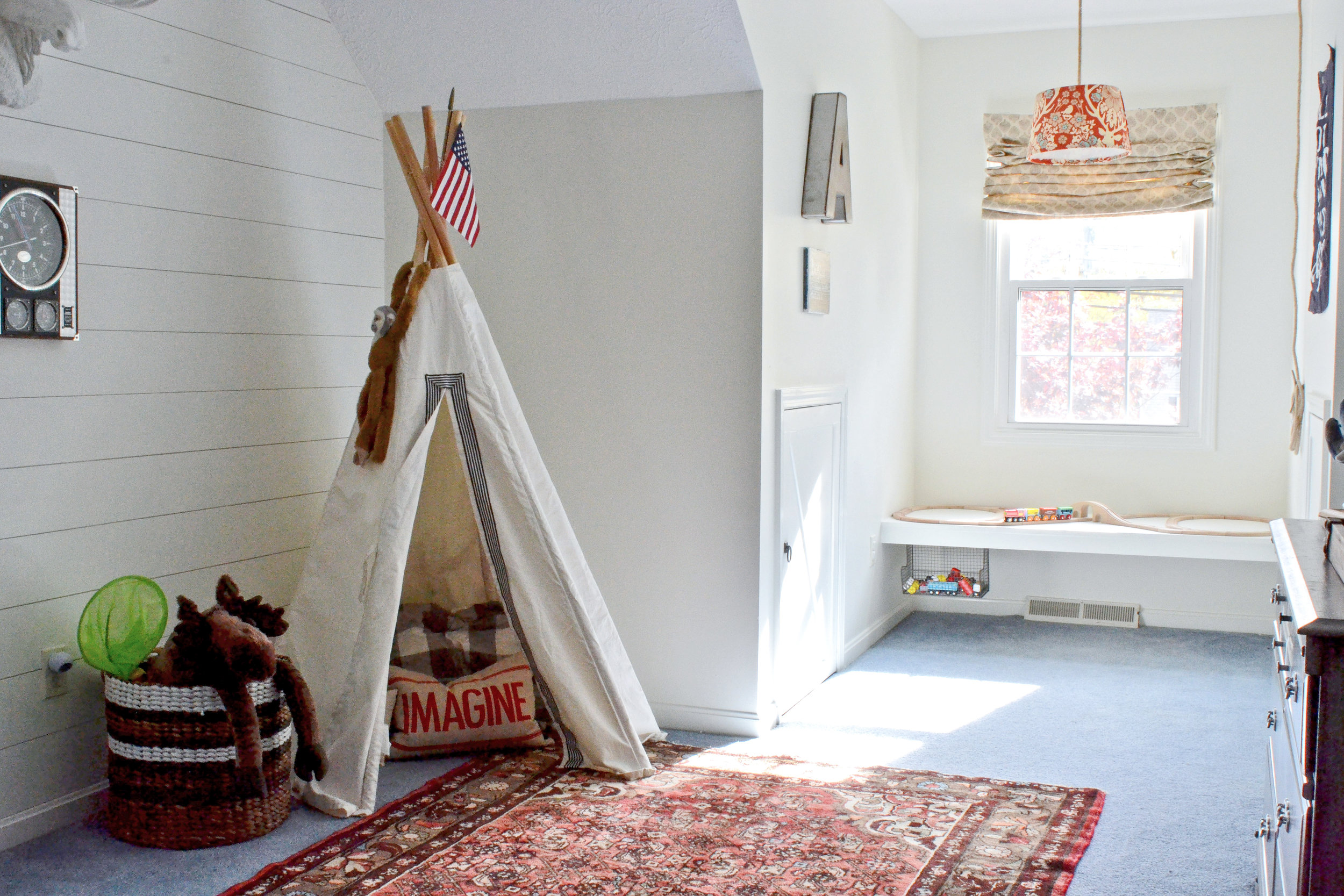
Next, the little boys room. This room had blue carpet that was in decent condition and wasn't in the budget to change out. The initial design stage focused on creating a room that would work with the blue, and make it look purposeful. While there isn't a "theme" in the room, since the house is a lake cottage, the "lake house" vibe is very fitting.
After

Before
I had the walls painted white and installed shiplap to the back wall to add interest. There are red/orange and blue details throughout the room to give hints of "nautical". I also installed a floating window seat in the dormer. This seat can be used for reading when he gets older, but for now serves as the perfect train table.


Part 3 (the living room and master) are still in progress and will be posted whenever they are finished. I hope you've enjoyed this home tour. To get more design inspiration follow me on instagram and pinterest.
Thanks,
Nikki
South Meets Lake- Cottage Tour- Part 1
Today I'm sharing part one of the #VWSouthMeetsLake Cottage Tour. Built in the 90's, this cozy cottage (less than 2,000 sf) was in need of some very budget-friendly updates to make it a place a young family of four could enjoy. I've been working on the updates to this home, slowly, for the last year. Located just walking distance from the shores of Lake Erie, it was designed with the traditional cottage front porch that everyone loves. However, some of the interiors felt dark and closed off from the other areas.
I took inspiration from the nature all around Lake Erie, and tried to tie in fun color and pattern representative of a young, fun family. A big goal for this design was to make the interiors feel stylish enough for the adults, but not too precious that the young children couldn't enjoy it.
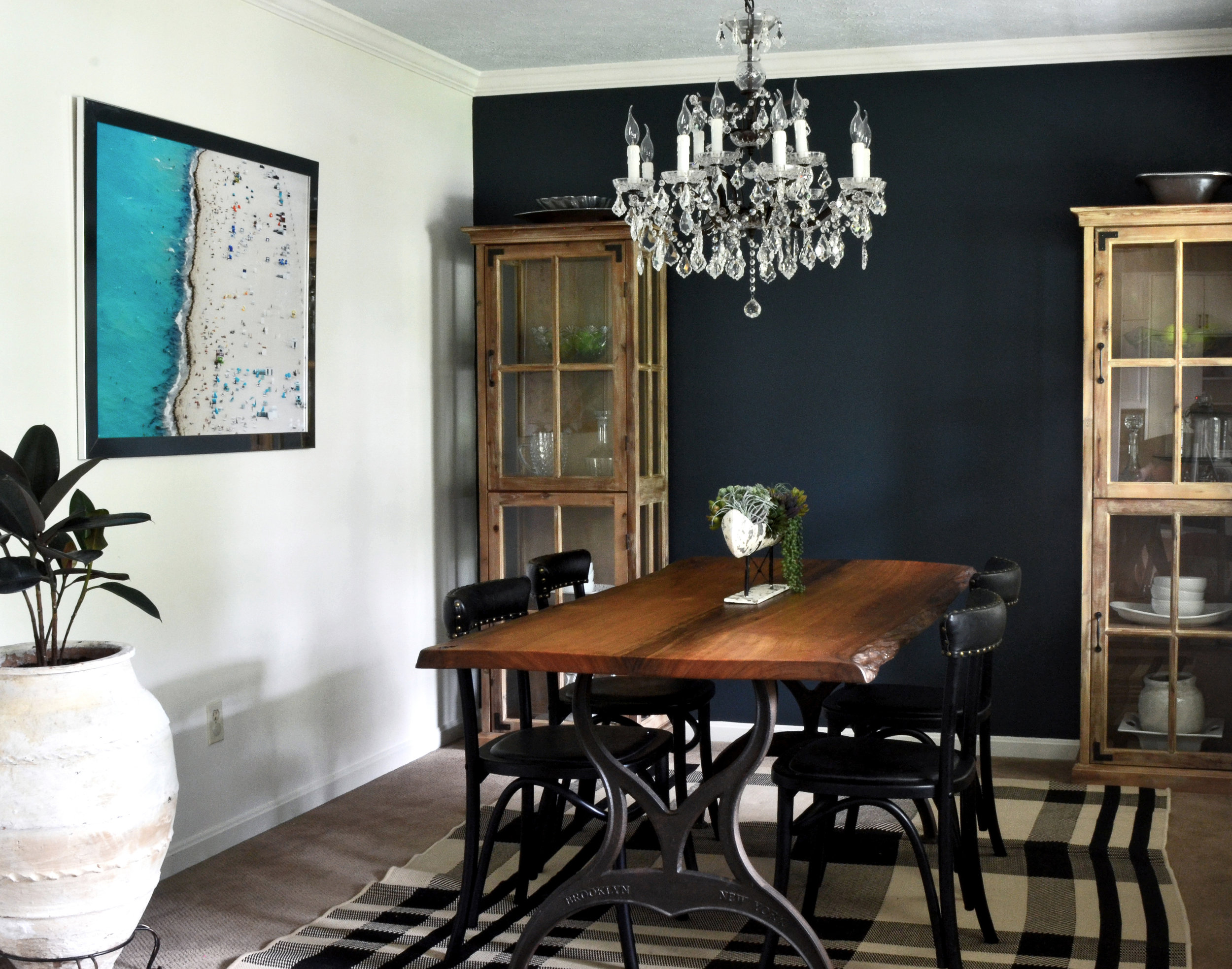
Before, the dining and entryway were pretty closed off and dark. Separating the dining room from the rest of the house left it feeling more like an office than a dining room.
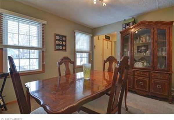
Dining Before
I had the wall between the entry and dining room opened up and installed a new, wooden door with glass to let in more light. Painting the back wall of the dining room and placing a curio cabinet on each side helps to create a more dramatic backdrop verse the pass through that it was before.
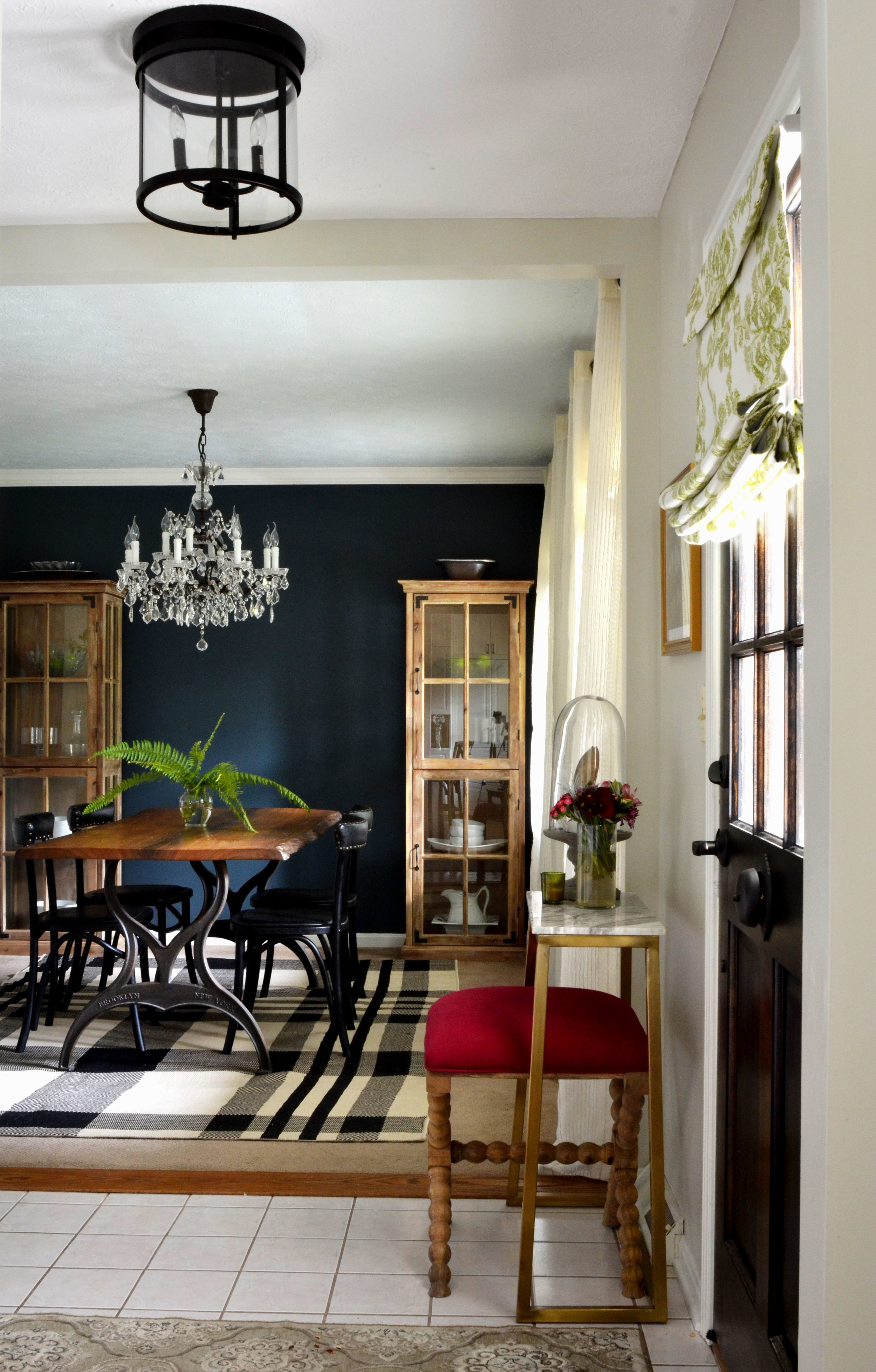

Dining Before
The powder bath is as small as you can get and still be functional. I just wanted to keep it simple with a white wall on top and black shiplap under the chair rail.

The kitchen before had so much floor space that you could literally dance across the room, but there was a lot of wasted space. When it came to cooking there was barely any prep area and not much storage.

Kitchen Before

Kitchen Before
I designed an island that fit a couple bar stools in the center of the kitchen. I also had the wall of cabinets moved to the laundry area of the basement. In its place, I installed a wall of floor-to-ceiling cabinets. These cabinets now hold the microwave, toaster oven, hooks for coats, and drawers for shoes.

The laminate counter top was replaced with soapstone, and a marble back splash, in a fun pattern, replaced the 4 inch laminate ledge.


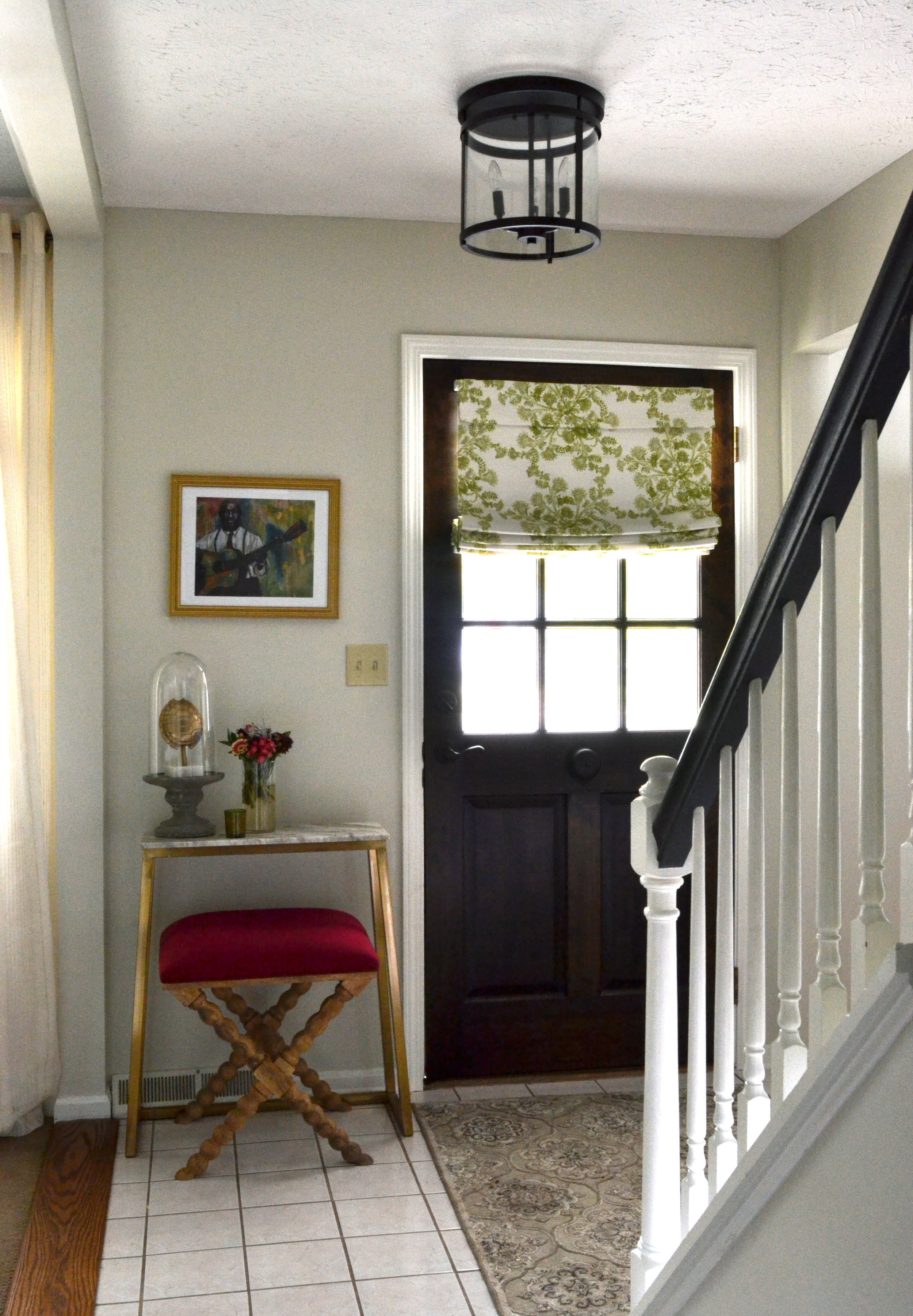
Closing out the tour for today, the hallway at the top of the staircase which can be seen from the front door. This hallway leads to the kid's rooms, so I decided to use the small area to display the family's collection of colorful art; including art done by the kids.
I hope you enjoyed part 1 of the tour. Part 2 will be posted in February, so stay tuned! For more inspiration follow me on pinterest and instagram!
Nikki
Julip's Toddler Room Inspiration
I have been scheming about the kid's rooms since we moved in. They are huge; Julip's is the biggest room in the house! We put our guest bed in there, so it has to serve as two spaces in one. That means the bedding and furniture need to coordinate in some way. 
before pic from previous owners
Her room in our old house was still pretty new and I still love the idea of make believe. There will be some new and old pieces. I'll be adding some southern charm to this new room; you know we have to represent up here. ;) I've also been working on a painting for above her crib. It's so southern and so meaningful to me...I can't wait to get it up.
Matt's making me keep the walls gender neutral since there is always a possibility that Abram could end up sharing the space with her. He says we paint too much. WHAT!? He's always my toughest client. I'm adding some "girly" colors with the accessories and things easily replaceable. I just love the way green/blue colors work with pinks.
I threw a quick inspiration board together to get the ideas on paper; hope you like!

Need help creating a home where your family can flourish? Check out our design services.
xo,
Nikki
Toddler Lake Bedroom | Storyboard
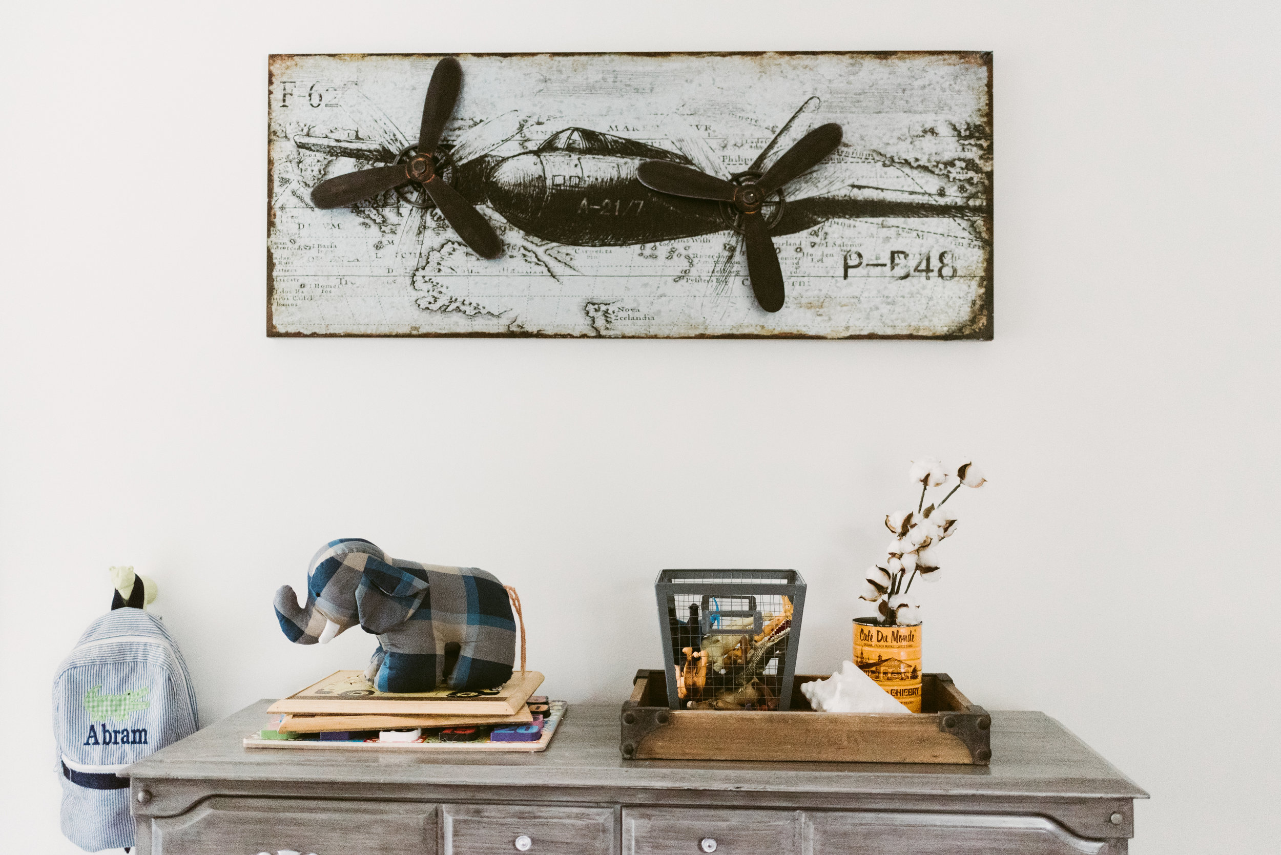
We are truckin' along on the small renovations and styling of our "lake" house. My goal was to have both kid's rooms complete, by fall, and the kitchen well under way. Well, it has been hard to get the rooms painted with little fingers everywhere, so we are making more progress on our kitchen than anything right now. First up on the blog chopping block is Abram's room. I had started transforming his room into a toddler room at our first house, and decided to go a bit further in this house. The "lake life" was a huge jumping-off point; he loves anything that moves and getting dirty outside. I am keeping the bed we bought to replace his crib, his teepee, and some of the art and decor (he still loves the planes over his bed). We are moving his shelves into Julip's room, and his dresser was always a cheap "stand-in" until we could afford a dresser that the drawers weren't falling out of.
The ceilings are only 8' so finding an appropriate light will be a challenge. I love the idea of a trunk for all of his random toys/train tracks, etc. The carpet in the room is blue...BLUE! At first I flipped out, then I decided to work with it (it was the inspiration). I have started painting the walls Benjamin Moore's White Dove to freshen everything up, and will add a mixture of pattern and color to break up the nautical vibe and keep the room toddler appropriate.
There is a dormer window in both kid's rooms. I initially thought I would add an easy window seat to both to shorten the length and give the kids a place to sit and read. Unfortunately, there are ac vents at the base trim under both windows. In Abram's room I'm now thinking about some type of floating window seat, and either a rope shelf or industrial shelf, depending on how lazy we get when it comes to building something.
xo, Nikki

Out of respect to my clients I only post some sources on the blog.
Bed | Wall Lamp | Dresser | Chandelier | Sheets
Need help creating a home where your family can flourish? Check out our design services.
Our First House | A look back
The house in Houston was our first house together. I graduated with my master's, we got married, and had two children while living in that house. I thought it would be a lot harder to leave it, but after months and months of moving delays we were ready to get the show on the road. Still, it is awesome to look back on that house and see everything we did to it with a VERY small budget.

Before: the view of the house was completely blocked with overgrown oak trees and rows of tall bushes. The shutters were aged and you couldn't even see the ones on the left side.
After: we trimmed the oak trees, moved and removed some bushes, and planted some more color and texture. We also repainted the shutters and replaced the front door with a a rod-iron style.
Before: There was one flower bed in the back yard. It was in the back corner and had two mexican palms, a row of holly bushes, and a row of box woods. The mexican palms always look like they're struggling because of the way they grow and they got tall extremely fast, making it hard to keep trimming them. The row of hedges was also hard to keep up. The holly attracted wasps like crazy in the spring and would grow so fast that it was hard to keep the "hedge" look. As soon as some parts would start to grow it would look horrible, and I would get chased by wasps when I tried to clean it up. I was so sick of that flower bed.

After: We raised the beds a bit and added texas ash and river birch trees to provide shade when they got a little bigger. I kept one holly and trimmed it to make a small tree. I planted a mixture of flowering bushes to cover the electric box (they grew in more before we moved), oleander, and other tropical plants in groupings. We also planted a small magnolia tree and added a bed with azaleas right outside of the master bedroom windows.


Before: The cabinets and floors were all the matching, stained orange oak of the 90's.
After: We repainted and antiqued the kitchen cabinets, and then added the hardware. I added trim around the stove hood to make it look a little more "finished"; it always felt like it was missing something before. We also repainted the entire downstairs because the paint was a flat white color with a pinkish hue.

 Grey Chairs | Driftwood Mirror (from TJ Maxx)-similar here
There was no light in the living room, so we added the ceiling fan with a light...it made a huge difference.

Before: the powder bath was so gaudy, and the fixtures and mirror all matched the walls.

After: I sanded all of the faux texture off and repainted. I did a stencil on the main wall you see when you walk in. I repainted the mirror and light, and changed out the faucet.

Before: the game room was a sea of beige. I not opposed to beige, but for some reason the colors used made the room feel small, dark, and the ceiling felt very low.


After: Repainting the walls with white at the top really opened up the room. The ceilings instantly felt taller. We also replaced the carpet and added a dividing shelf to change up the space plan a bit and make the room more functional.

Before: This was our junk room. It was where stuff collected and no one was allowed inside.


After: Abram's nursery and big boy room. New paint, lighting, carpet, and curtains to make the window feel larger.

Before: Spare bedroom (photo taken after I started unloading the shelf). It wasn't bad, but wasn't great.


After: It felt much bigger with a lighter color, and was a fun nursery for Julip. We repainted, got new carpet, and a new fan.


Both of the main bathrooms started out a pink-white with un-framed builder mirrors and the long, shiny brass vanity lighting of the 90's. I can't find the before pics I took.
After: I painted the walls and changed out the light fixtures and sink faucets. We also added the mirror frames using a combination of tutorials. In the kids bathroom I took off the towel rod that was hanging off the wall, and installed towel hooks from World Market. It was much more useful when we had multiple guests coming for the weekends.


The master bedroom was dark before (again, missing the picture), so my main goal was to brighten it up with paint and new carpet.
This house will always hold special memories as a place where our family grew. It is also proof of what can be done with a small, starter/student budget. I little bit can make a big impact. The current owners are continuing the upgrades, and I love it all. That house is so perfect for a family! I'm currently transforming our "lake" house and can't wait to take you along for the ride.
xo,
Nikki