
Red Dirt Relaxed Project
I was recently able to travel and photograph an E-Design project I completed last summer. This home is the couple's 18th move! Yes, you read that correctly. You can now pick your jaw up off of the floor. The wife is a real estate agent who really knows how to select a good home and has an amazing sense of style, but after 18 moves is burnt-out of constantly having to decide how to do each of their homes. On top of that, she was getting tired of her tan, red, orange color scheme and wanted a change. She really wanted something that she wouldn't normally select, so she contacted Vive Workshop. We started in her dining room, as it was the most bothersome to her. It is open to the family room and the large table she brought with her just didn't seem to fit. She is also not a huge fan of art. She wanted something that could draw the eye's focus on the back wall, but didn't clutter it with a lot of heavy items. I selected a gorgeous printed wallpaper that wasn't too bold, but added some of the relaxed, fresh blue she was wanting. Because the room is only two walls and the curtains would be covering one of them, we decided to just wallpaper the wall you see when you walk in the front door.
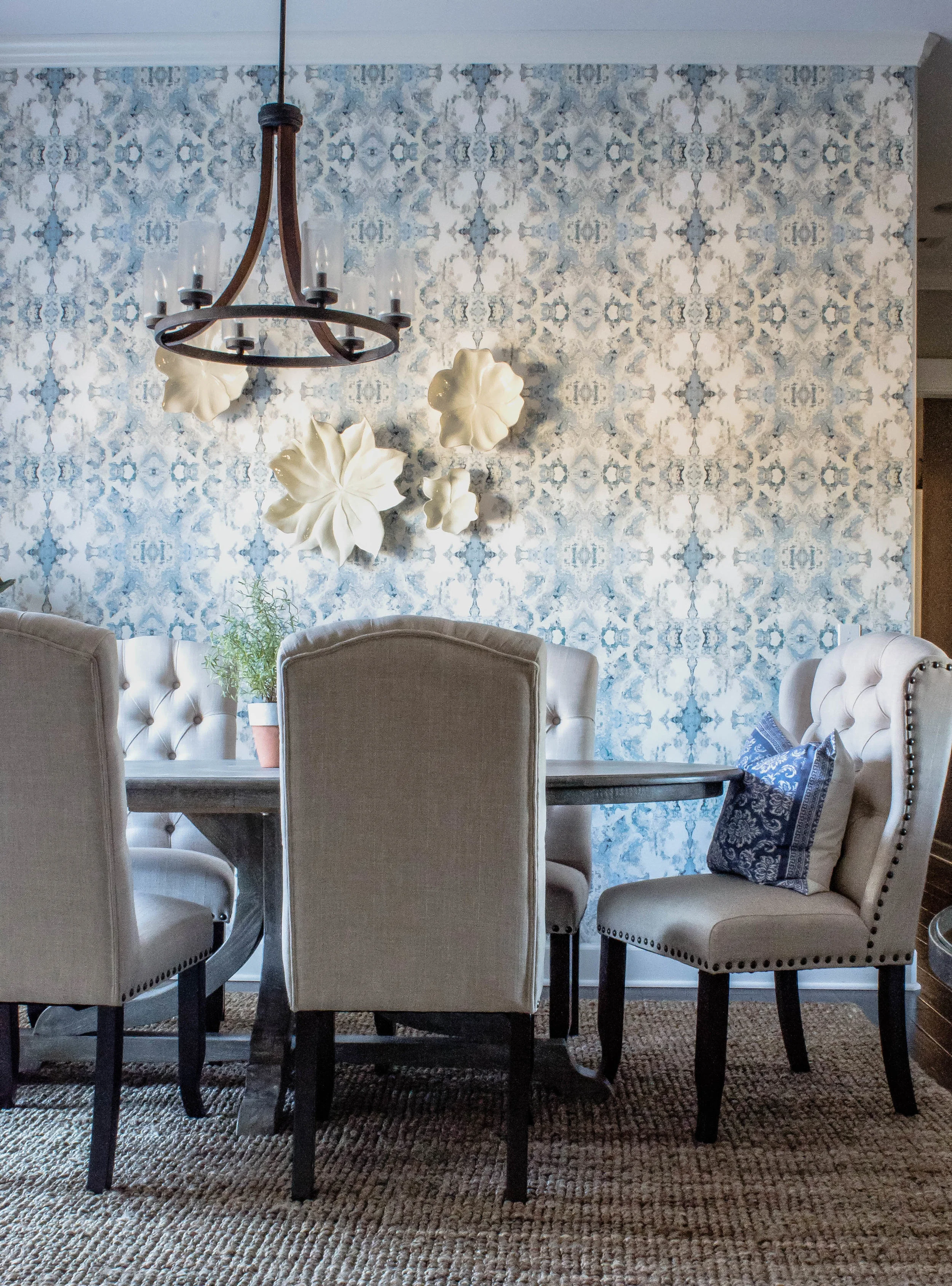
I selected an oval table that was large enough for seating several people, but wouldn't block the walking path. We kept the room pretty neutral besides the paper. We selected natural, white curtains and chairs that paired well with the textured woven shade and rug. White flowers layer on top of the wallpaper to add interest, but not weigh the wall down.

Her entryway needed a small anchoring piece of furniture and nothing seemed right. Then, by a stroke of luck, I found this amazing round table. It adds the perfect amount of character without trying too hard.
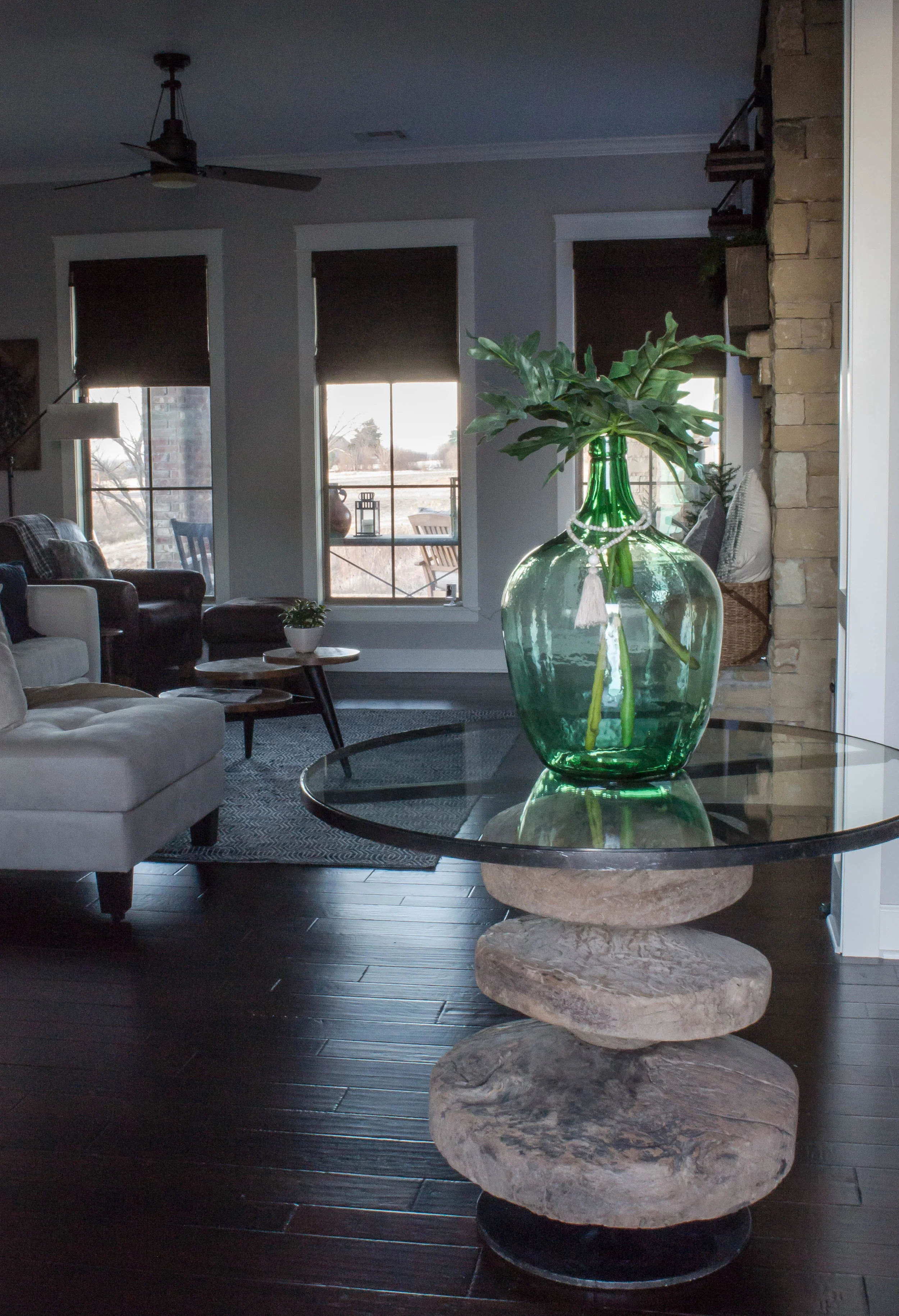
Lastly, her family room didn't feel finished. There were cabinets on each side of a large, stone fireplace that felt dwarfed, in scale. She also felt like all the dark wood felt broken up. We decided to make the wall appear as a cohesive set of built-ins. We installed ship-lap above the cabinets and had both sides painted a color that would serve as a transition between the grey walls and slightly golden-hued rock. It's amazing what paint can do! After mounting their tv on the left side, we found a botanical art that she already owned to hang on the opposite side and give the impression of symmetry.


I hope you enjoyed this tour! To find out more about the services we offer, click here.
Nikki